Merk & design voor Winfrey H.
Winfrey H.
Een juwelenhuis kwam uit een splitsing en had een eigen naam nodig. Wij tekenden eerst het woordmerk zodat de gevel kon veranderen, fotografeerden daarna de collectie in Taiwan en bouwden de website voor online zichtbaarheid.
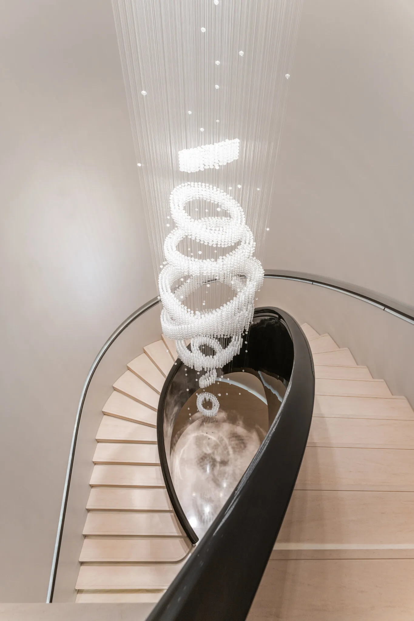
De trap is de echte eye-catcher
Getekend voor steen, daarna pas voor scherm
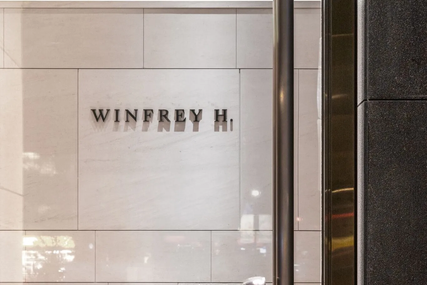
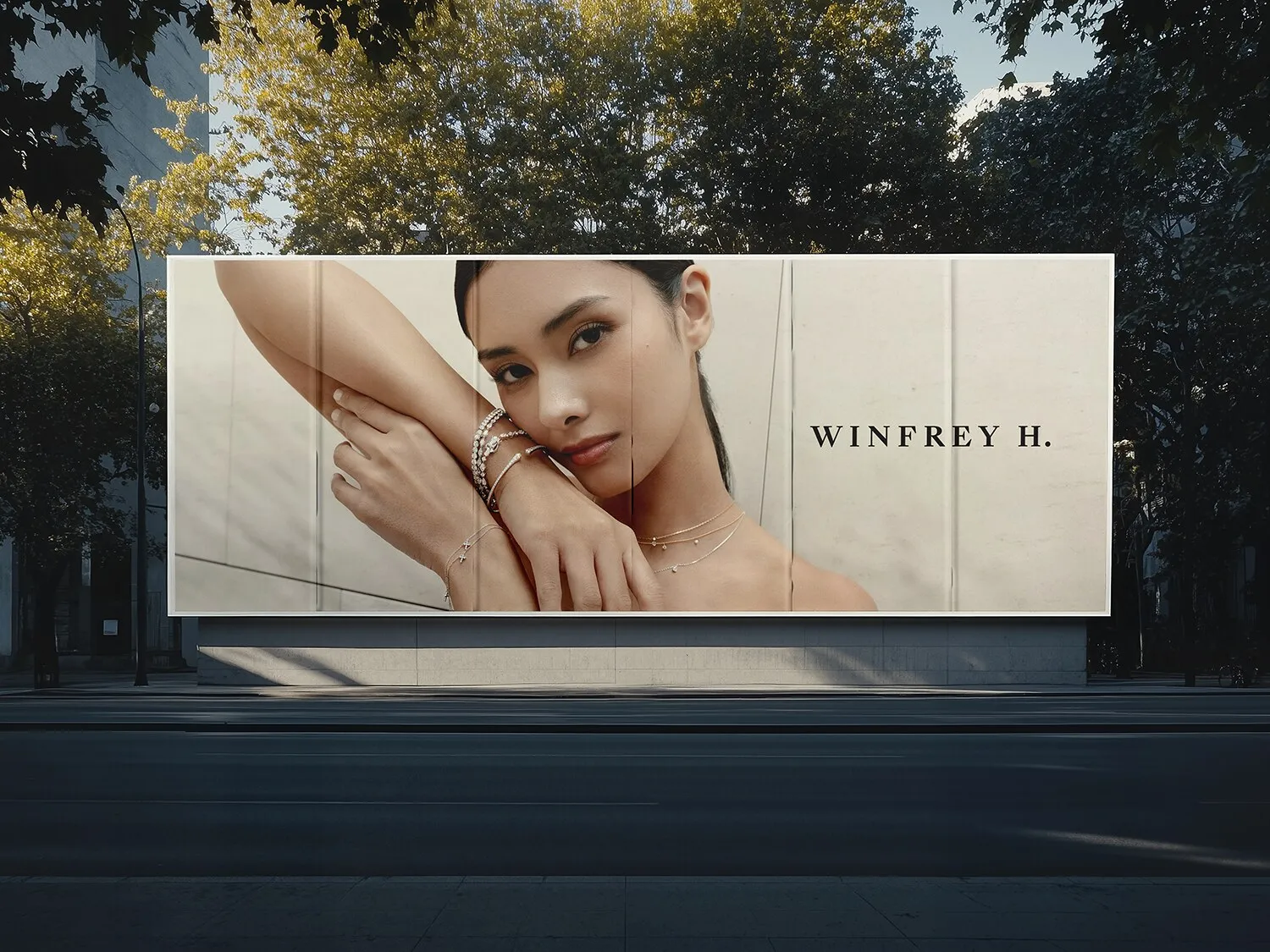
Een schreef met hoog contrast, ruim gespatieerd, sluitend op de afgekorte H. Geen monogram, geen vondst, geen ornament. In een ruimte afgewerkt in lichte steen en gepolijst staal is een logo dat presteert een logo dat concurreert met het product.
Het moest werken op twee formaten en vrijwel niets ertussenin: in metaal gesneden over een gevel, en klein gestempeld op een kaartje. Zodra dat klopte ging de signing in productie en veranderde het pand van naam.
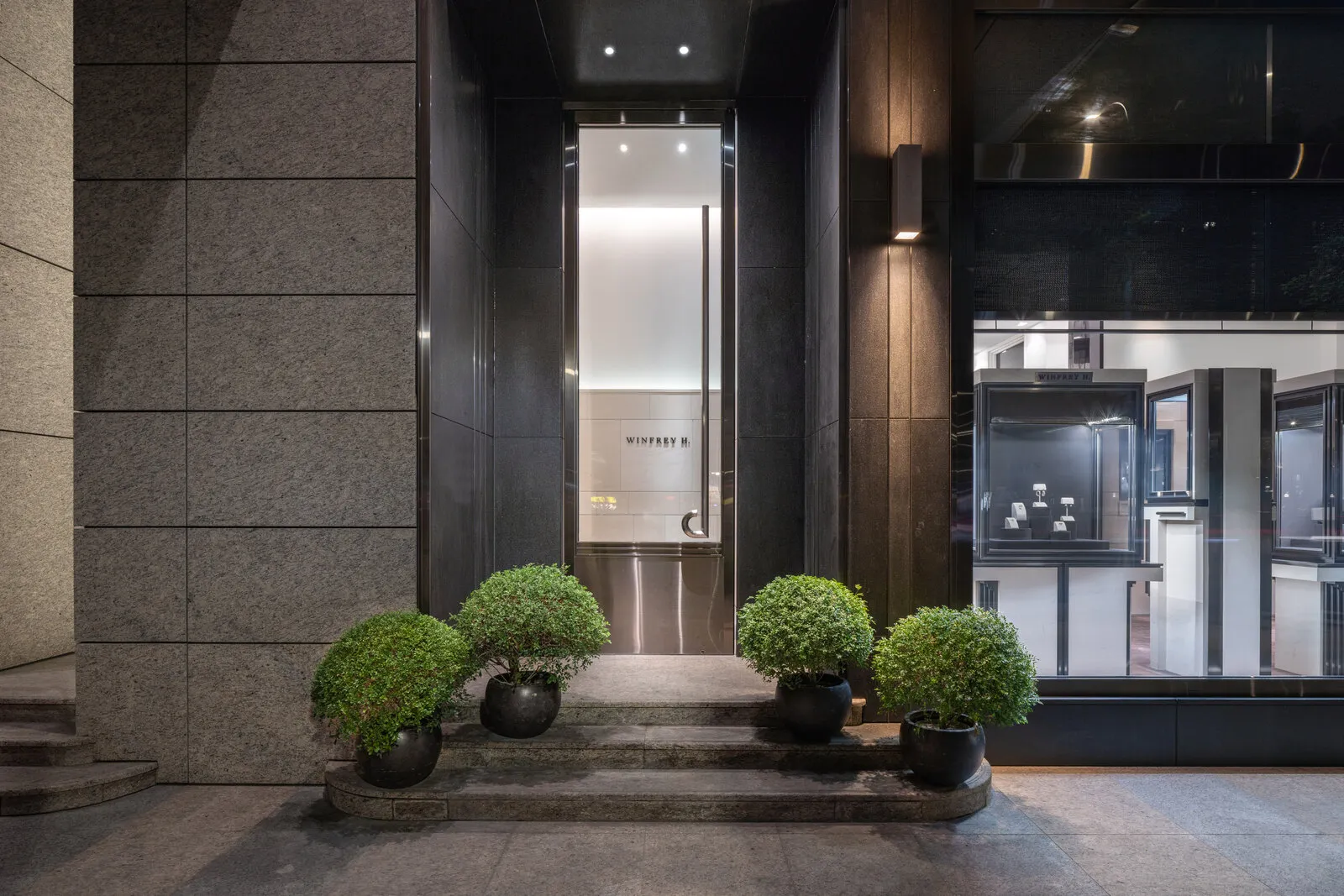
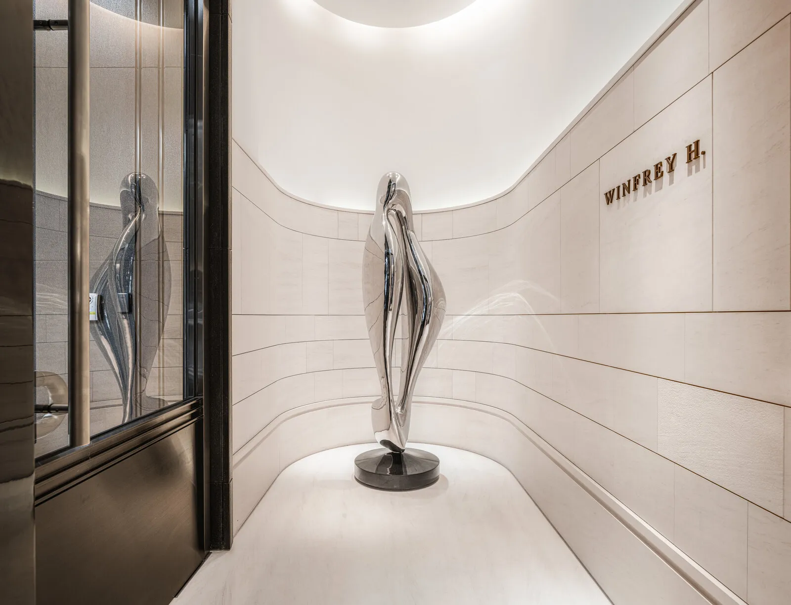
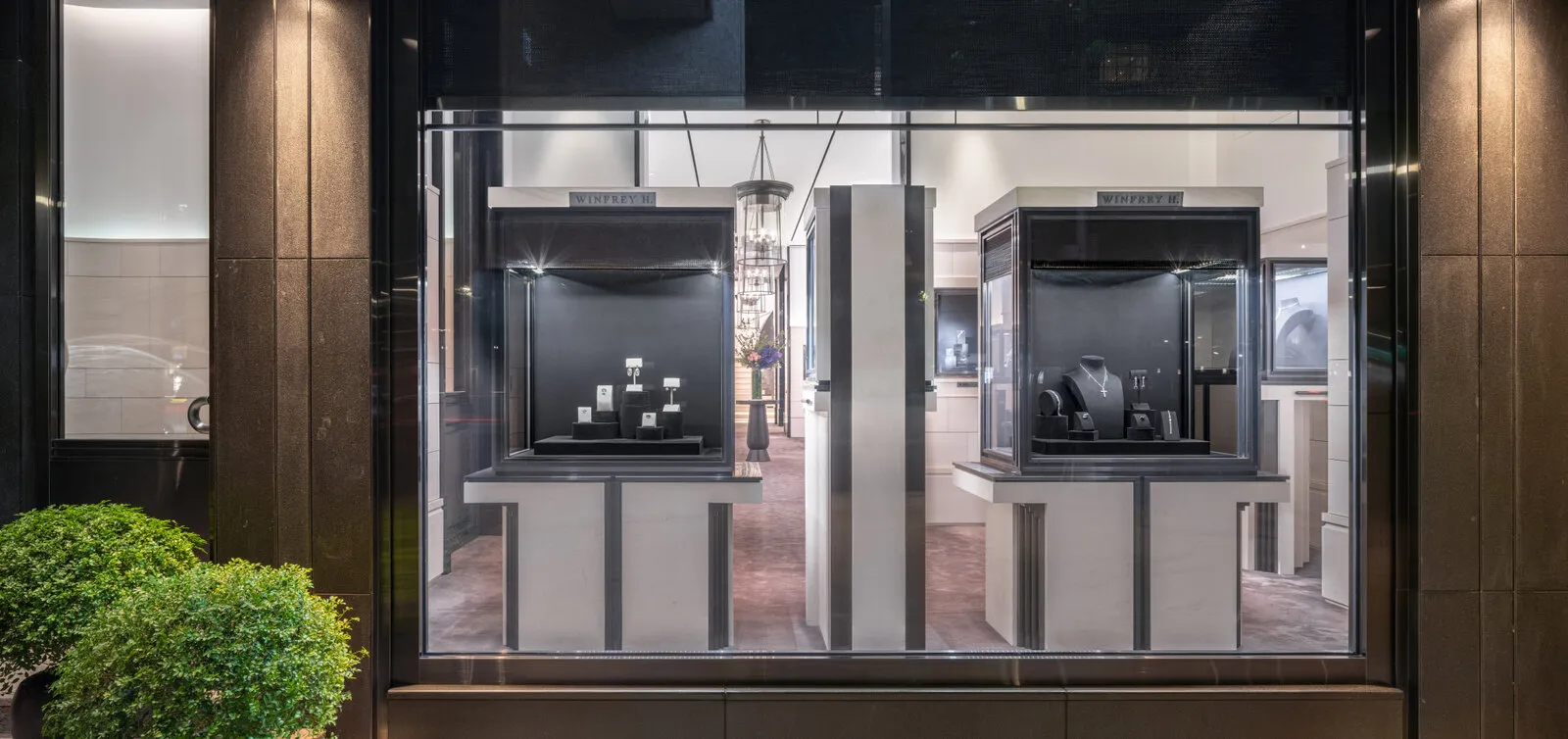
We zijn het pand nooit uit geweest
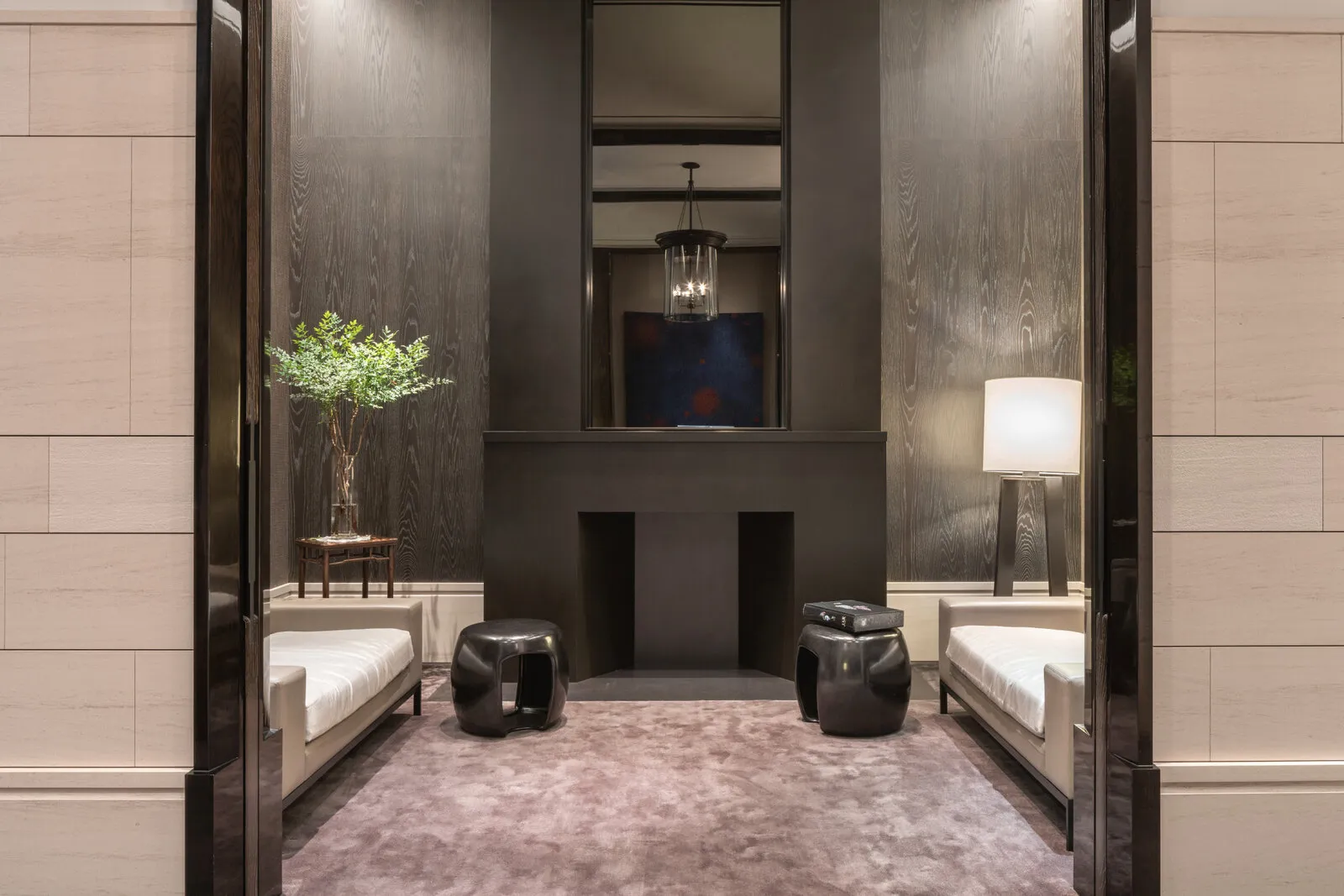
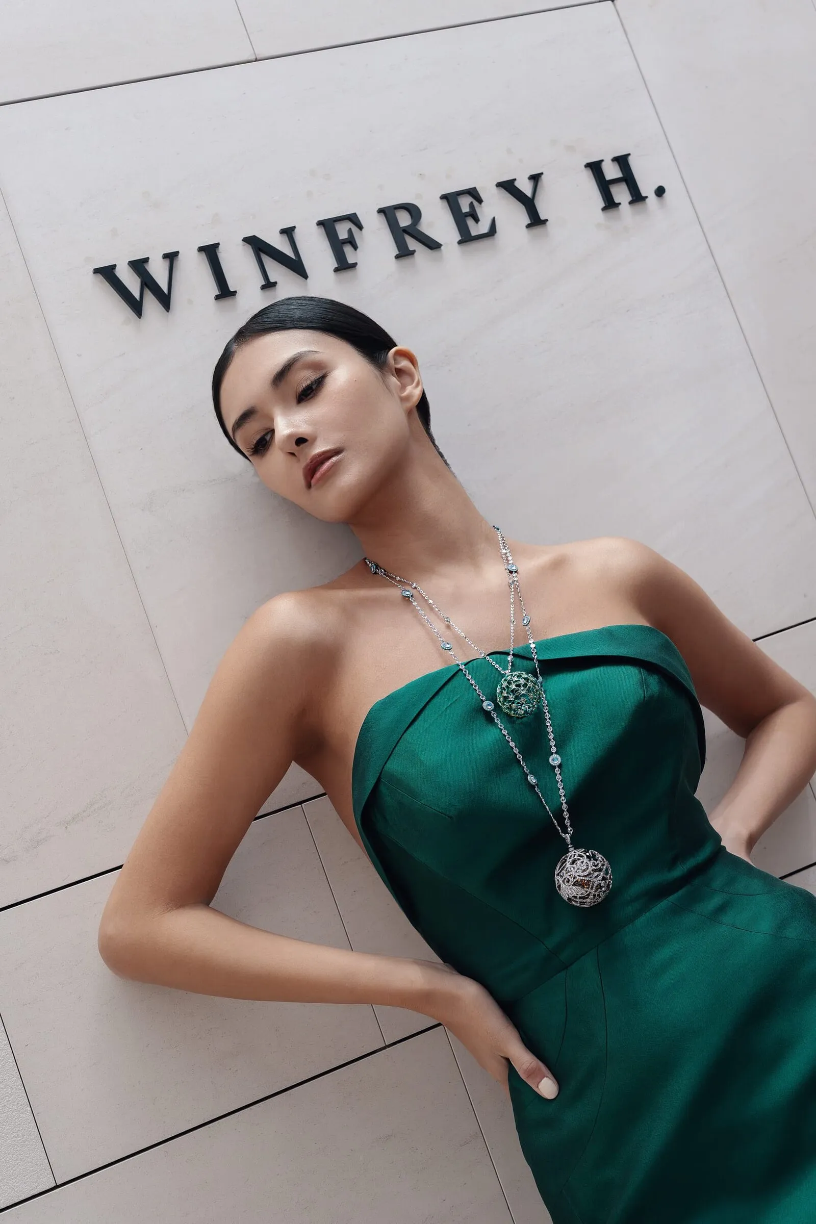
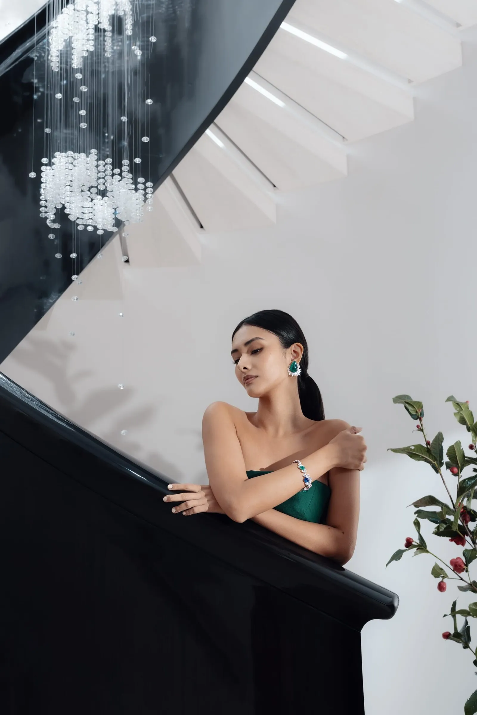
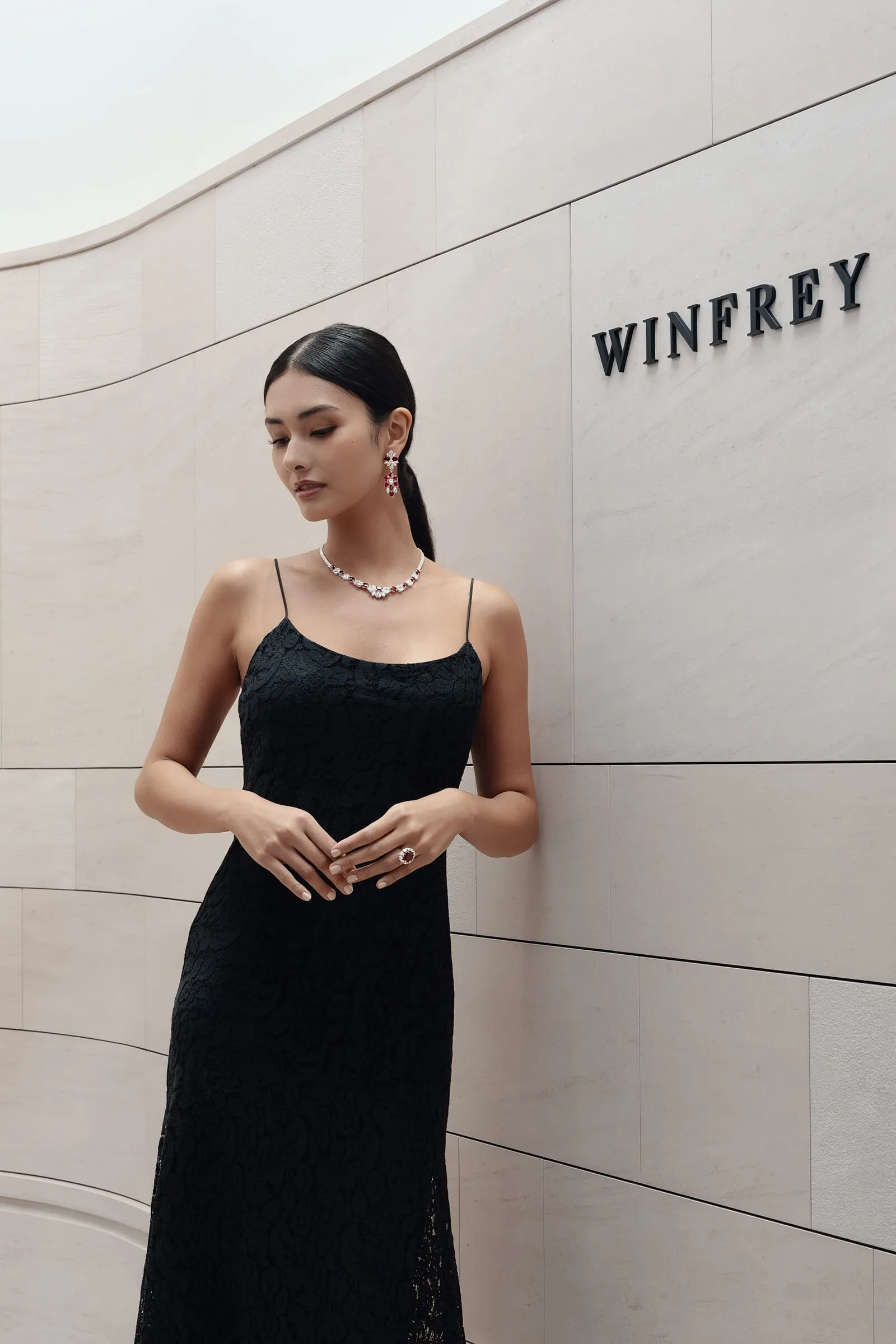
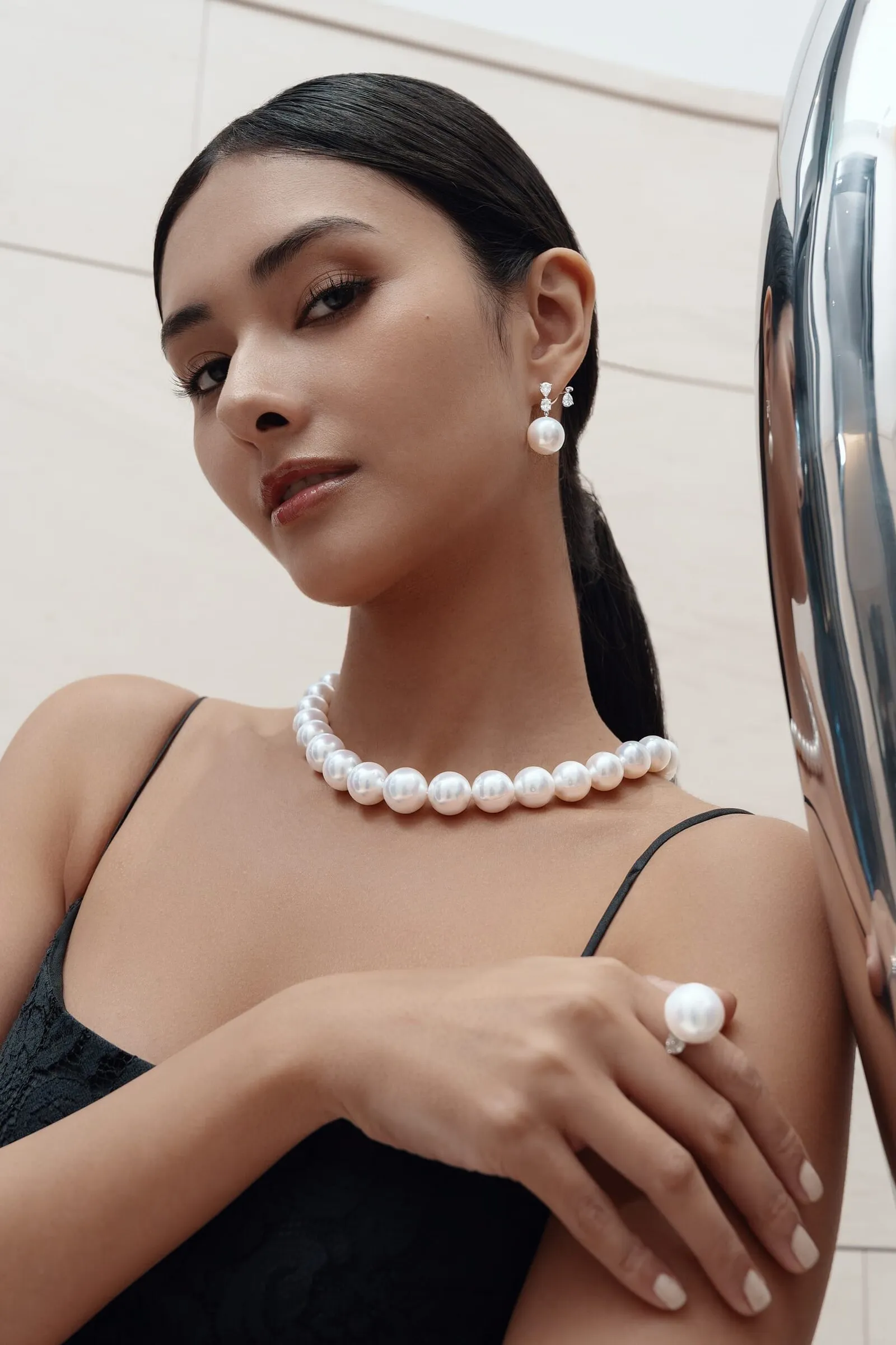
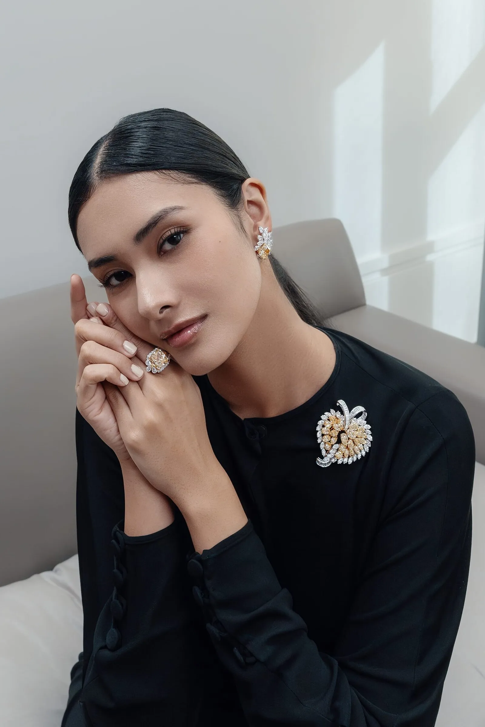
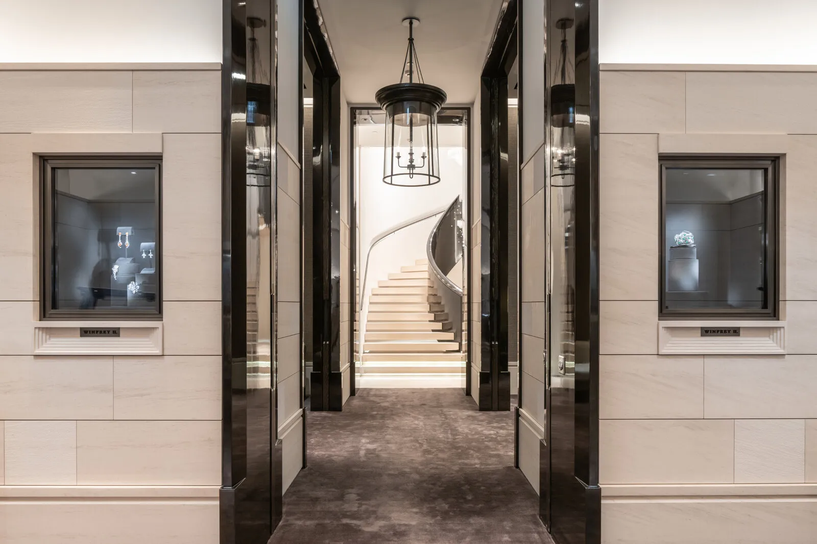
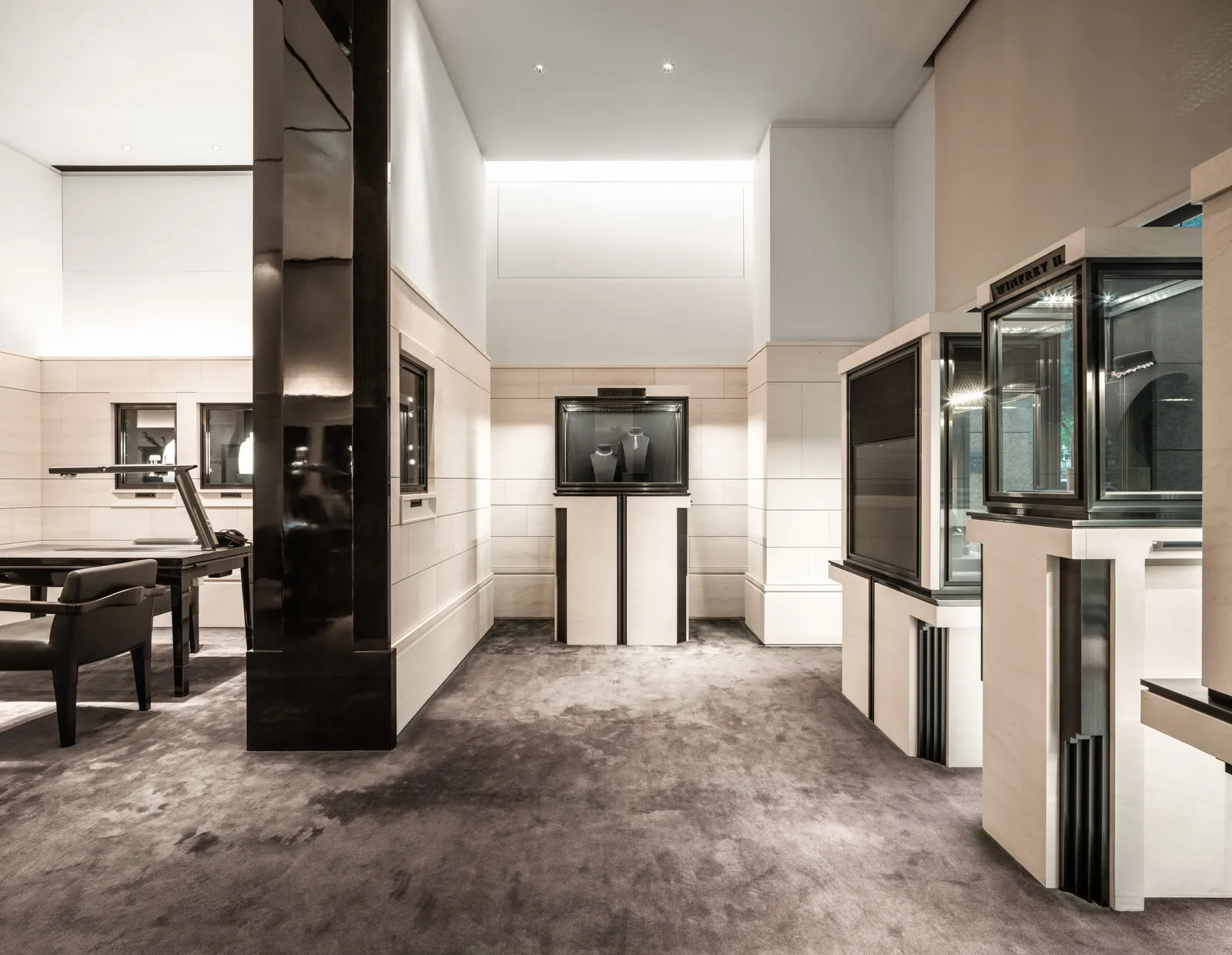
We namen het team mee naar Taiwan en gebruikten de winkel als set. De gebogen stenen wand, de wenteltrap onder zijn kristallen kroonluchter, de privéruimtes boven: de architectuur was het antwoord al, dus we lichtten hem uit en filmden erin.
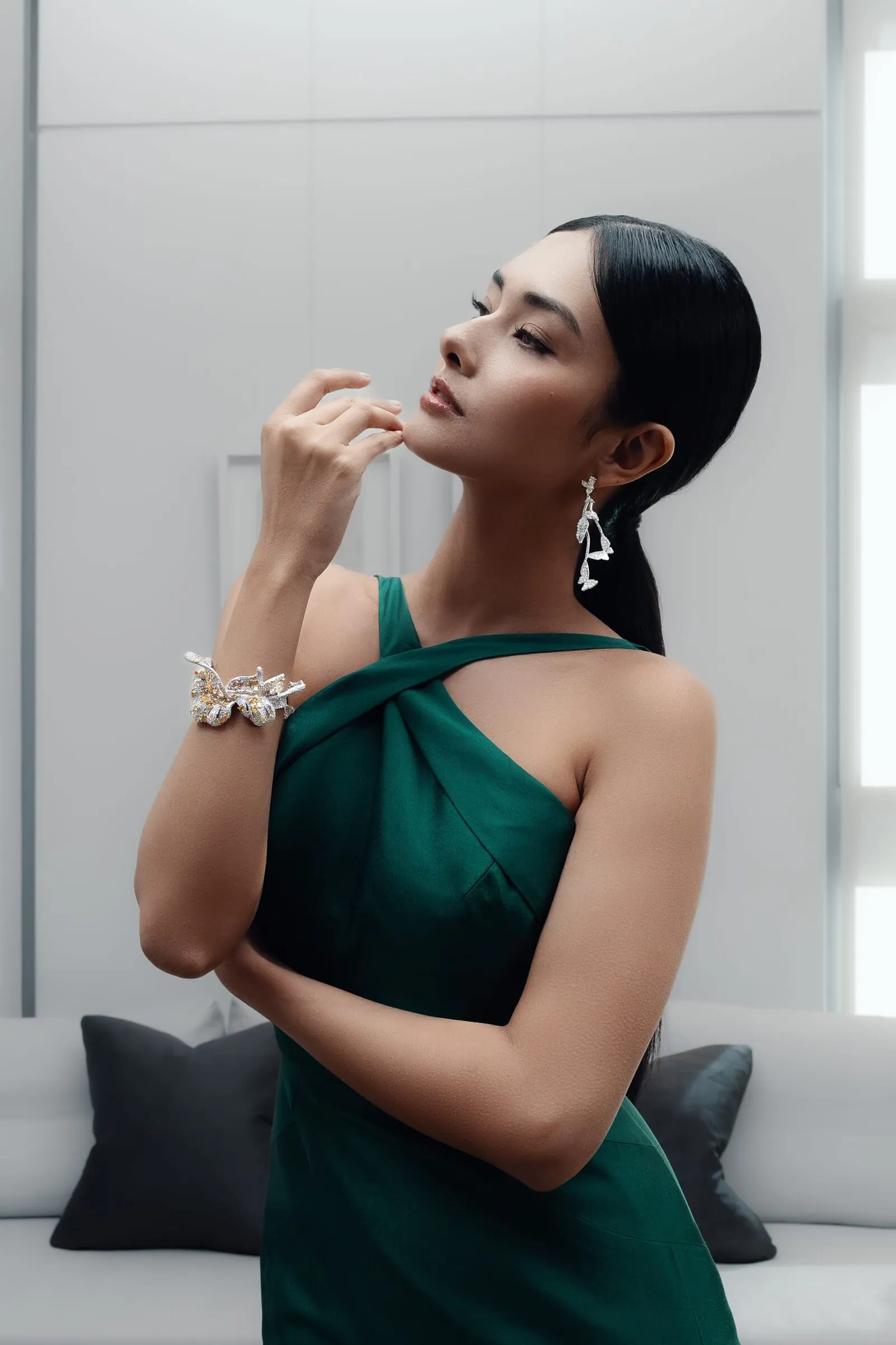
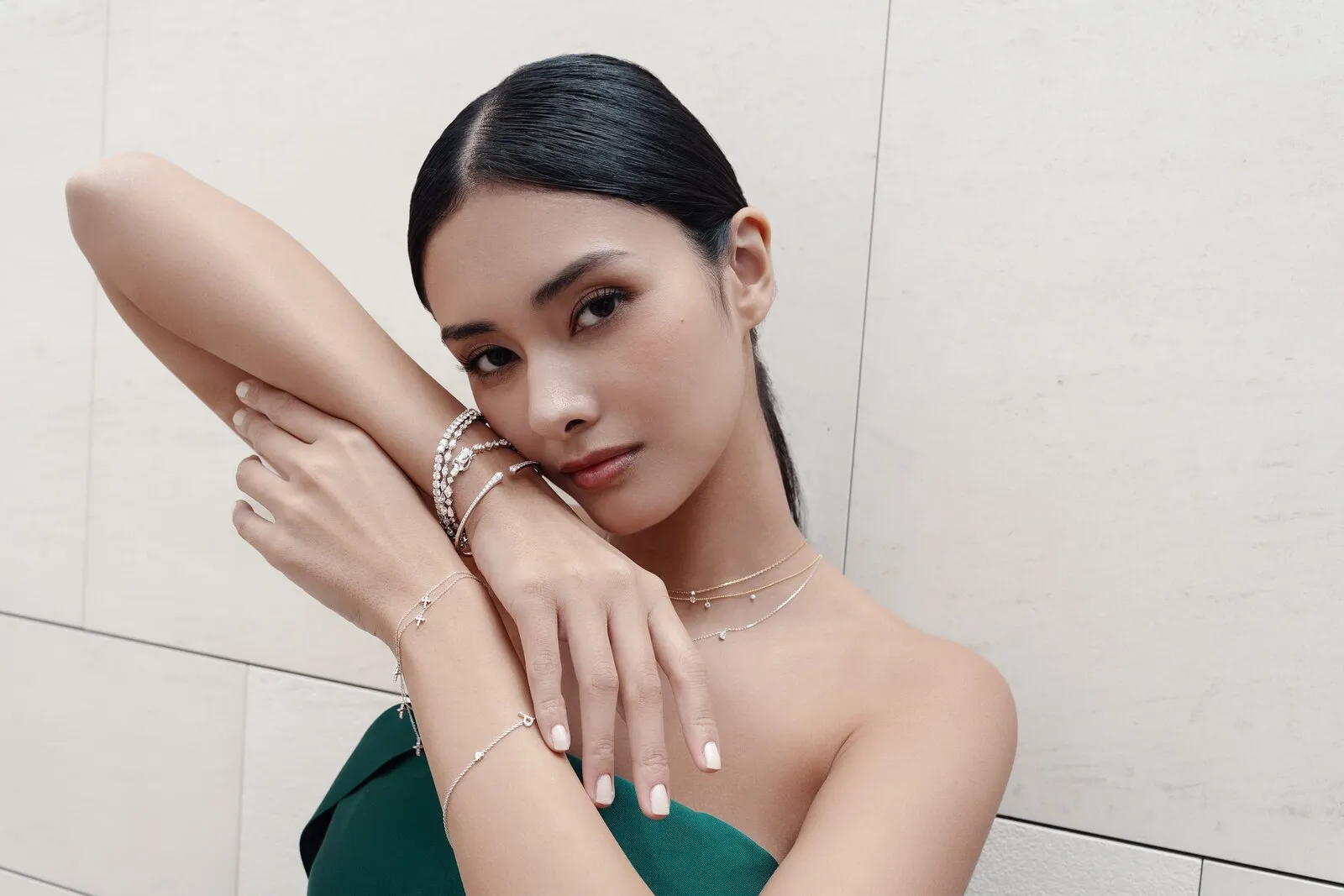
Een korte garderobelijst, diepgroen en zwart, gekozen om onder de stenen te blijven in plaats van ernaast te gaan staan.
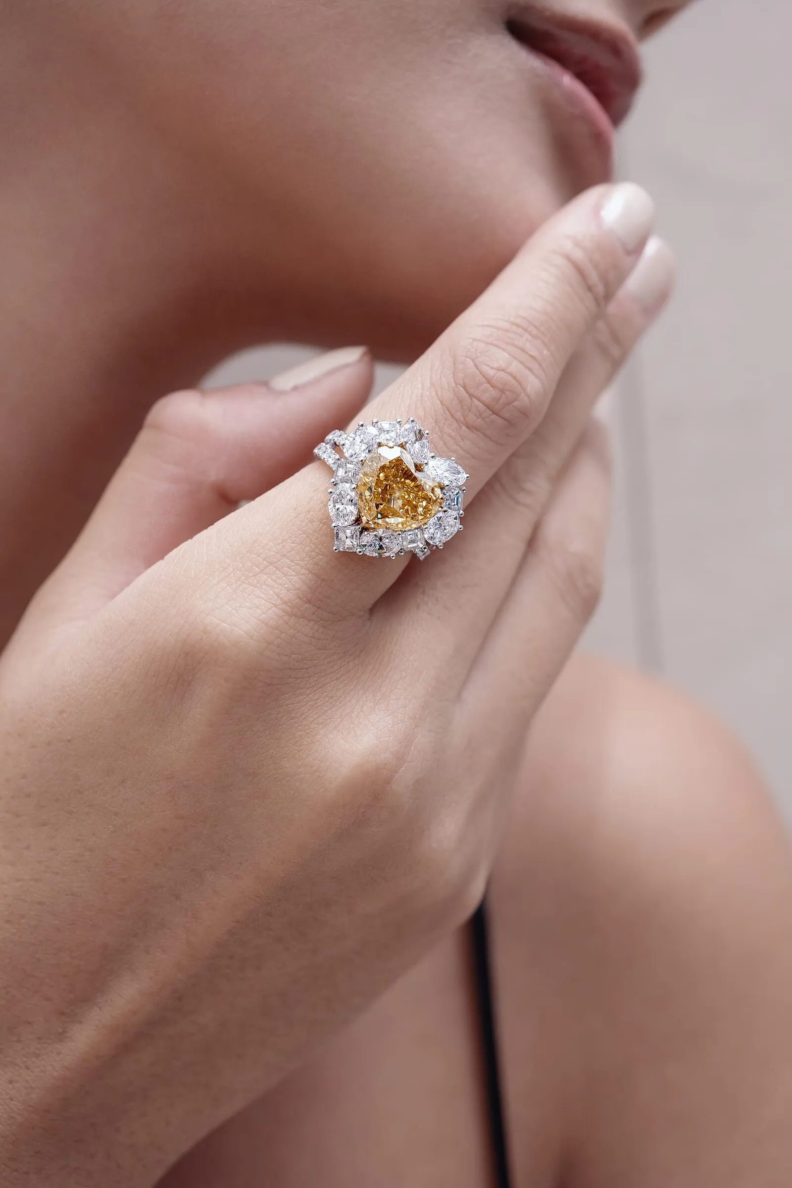
Een diamant vergeeft geen onscherpte
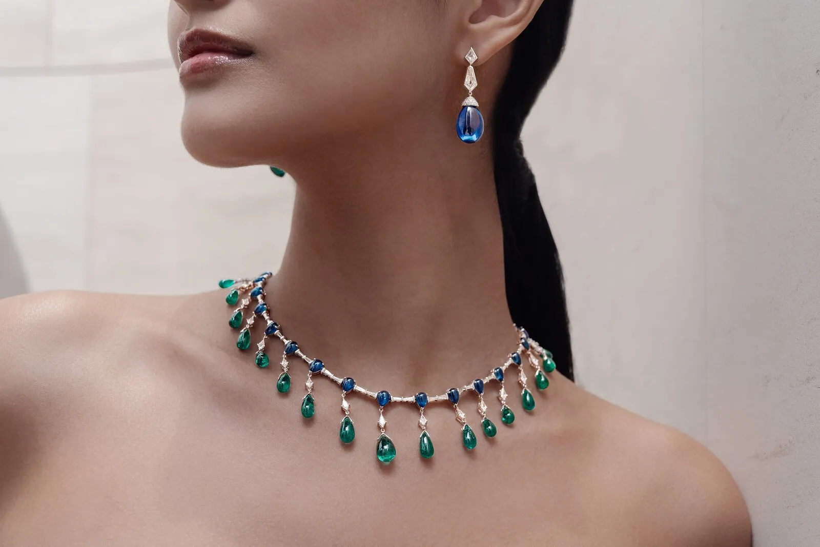
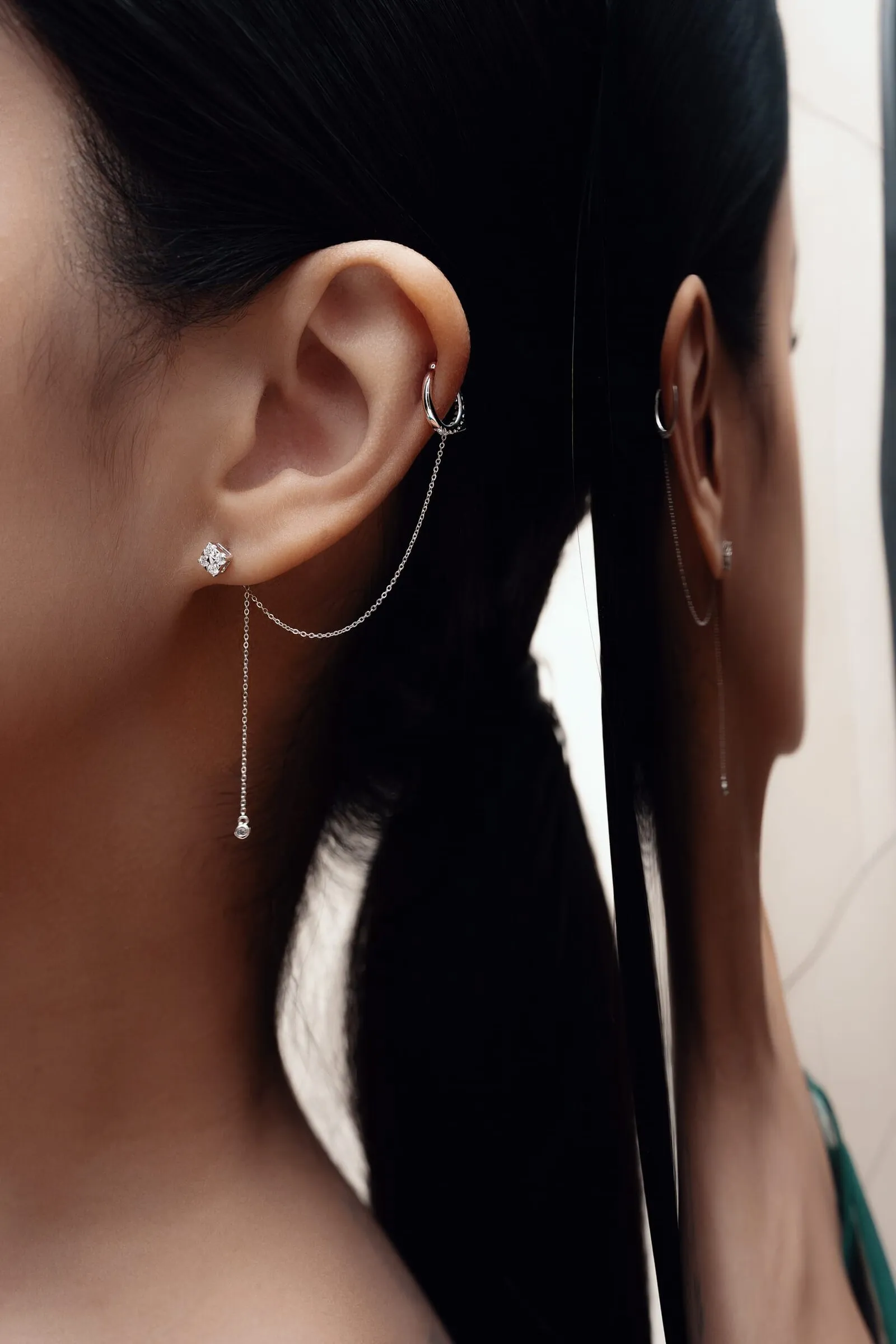
Elke steen moest messcherp in beeld. Bij diamant is dat de lastigste eis die er is: het licht kaatst alle kanten op en elk facet spiegelt de studio terug.
Uitlichten was dus het echte werk. Genoeg licht om het vuur in de steen te zien, net weinig genoeg om de reflecties de zetting niet te laten opeten.
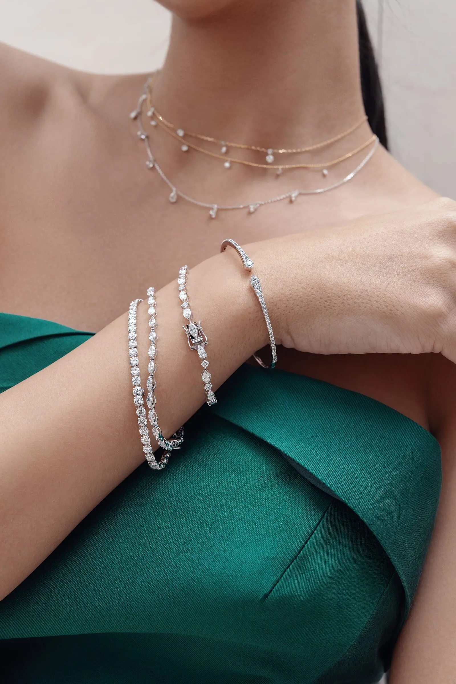
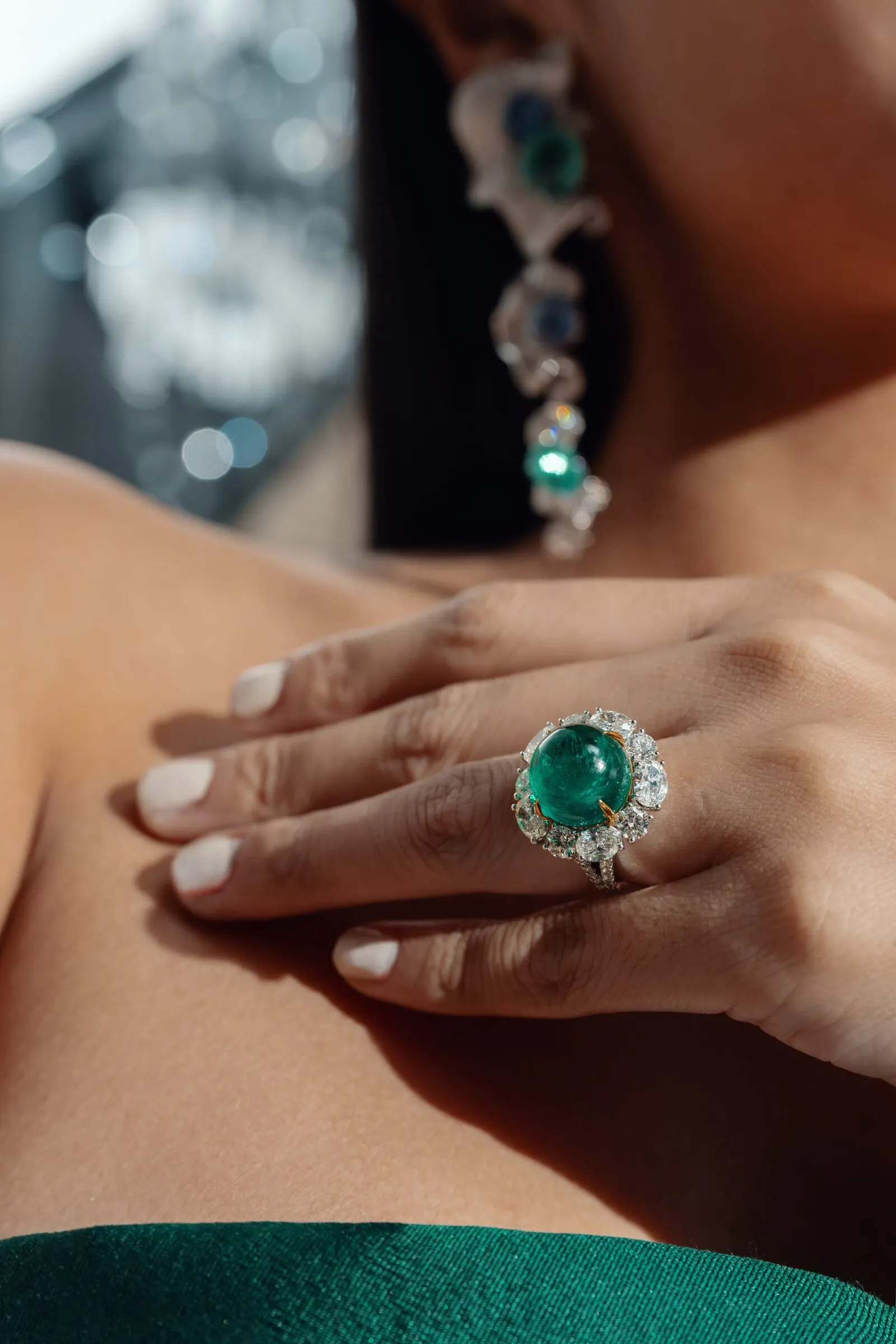
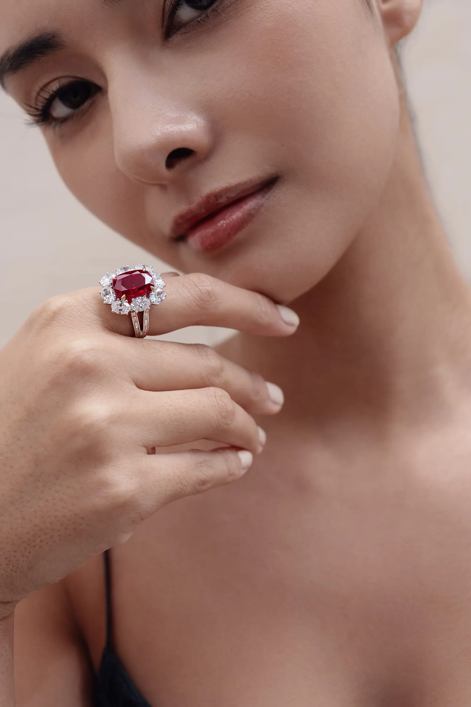
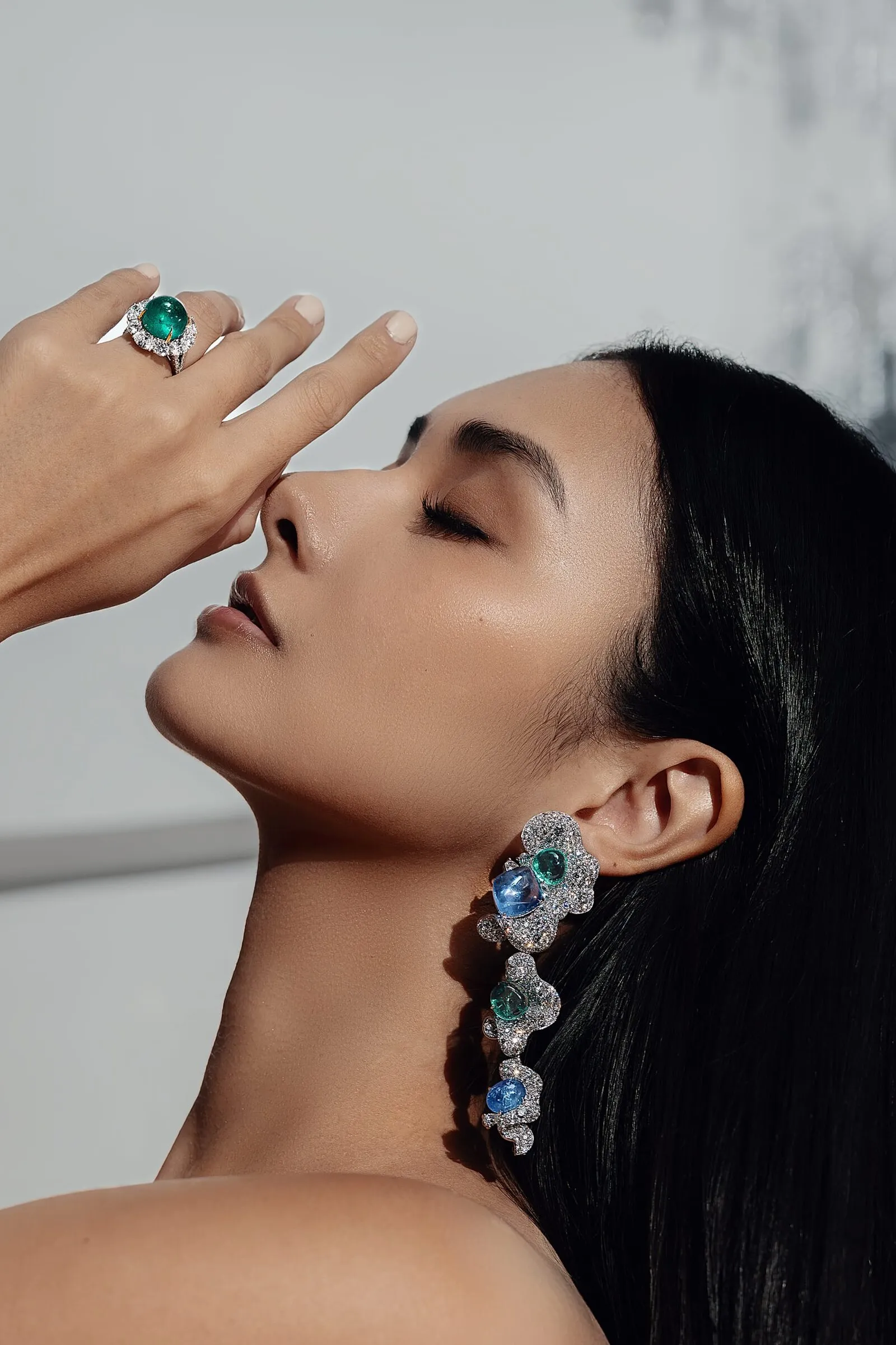
Dezelfde shoot, verticaal gemonteerd
De edits voor social komen uit dezelfde ruimtes en dezelfde looks als de stills: de zwarte kant tegen de gevelwand, de groene japon in de ruimtes boven, hetzelfde licht op dezelfde stenen.
Er is niets in het beeld gebrand, geen ondertitels en geen logo in de hoek, zodat één set bestanden in beide talen draait en langzaam veroudert.
Drieënvijftig stukken en geen bestelknop
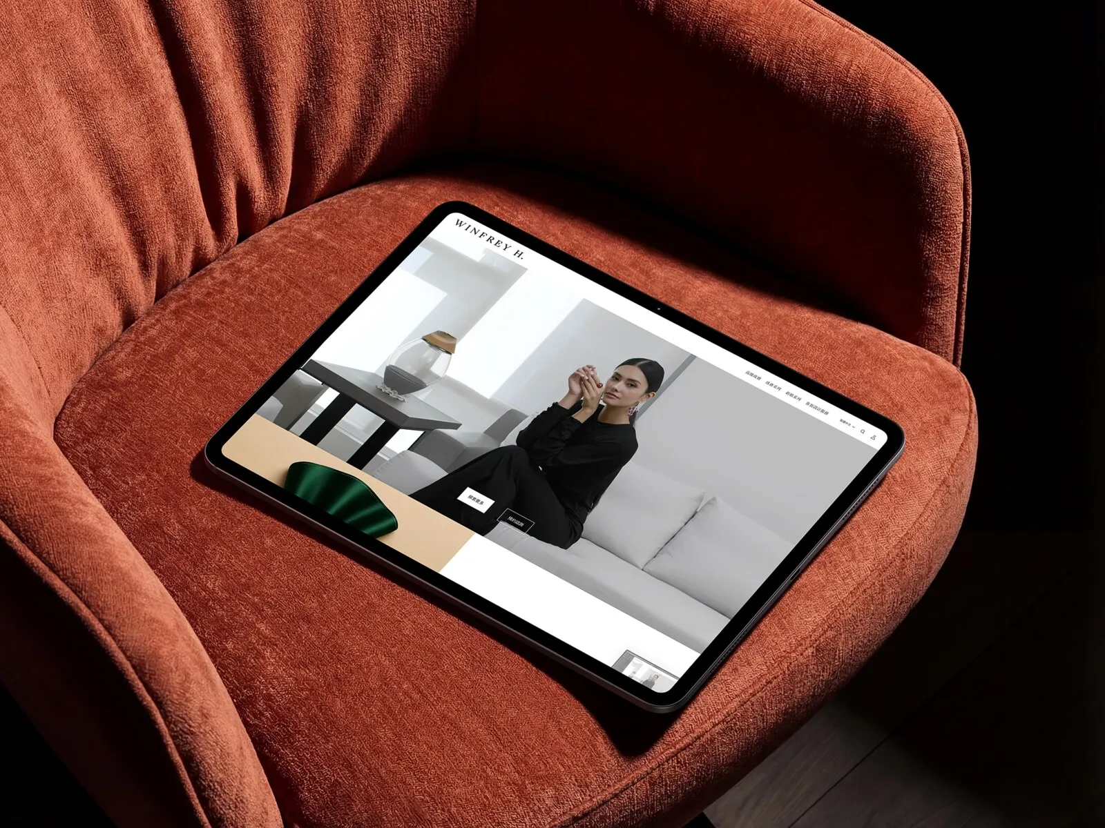
De webshop draait op Shopify, maar high jewelry rekent niet af als een T-shirt. Elke productpagina eindigt op Get quotation of Make an appointment, met het GIA-certificaat eronder. De transactie gebeurt nog steeds in de ruimte die we net een nieuwe naam hadden gegeven.
Campagnebeelden dragen de collectiepagina's, packshots dragen het grid, en het geheel draait in het Engels en in traditioneel Chinees. Huisstijl, beeld en winkel landden als één lancering, in de volgorde die het bedrijf werkelijk nodig had.
“Samenwerken met MG was een genot. Het team naar Taiwan halen, samen de shoot voorbereiden en zien hoe ze achter de schermen werken was geweldig. We zijn erg blij met het resultaat.”
Laten we samenwerken
Vijftien minuten, geen deck. Neem het product mee, dan zeggen we eerlijk wat we ermee zouden doen.
Volgende case
BenQ - Zowie Europe