Brand & Design for Winfrey H.
Winfrey H.
A jewelry house came out of a split needing a name of its own. We drew the wordmark first so the signage could go up, then shot the collection in Taiwan and built the website that carries it online.
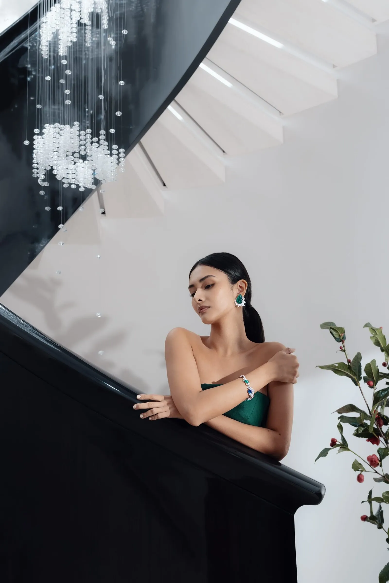
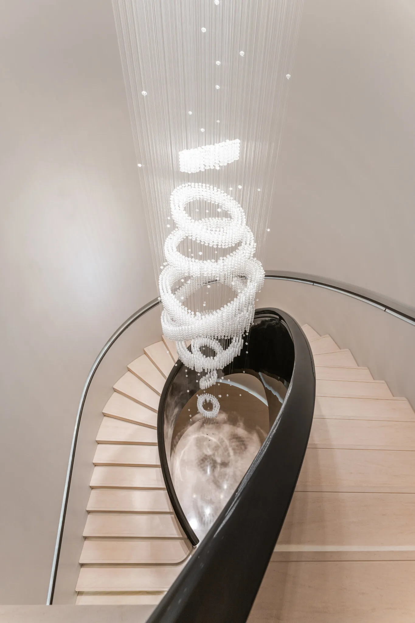
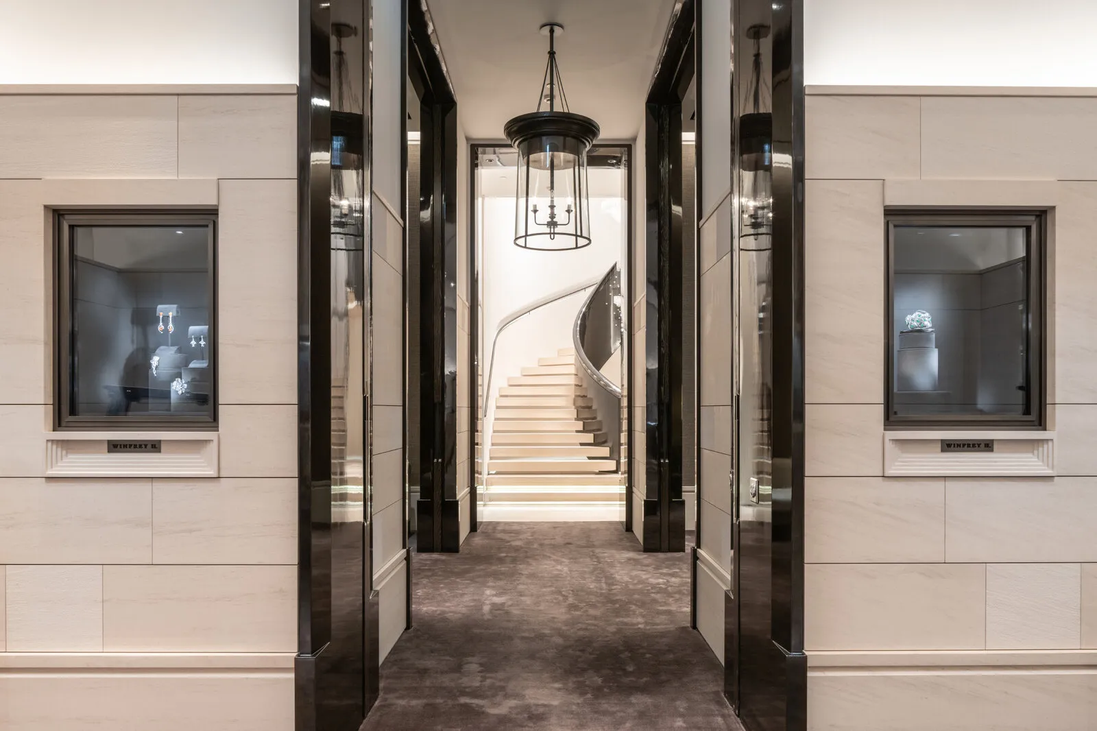
The staircase is the real eye-catcher
Drawn for stone first, screen second
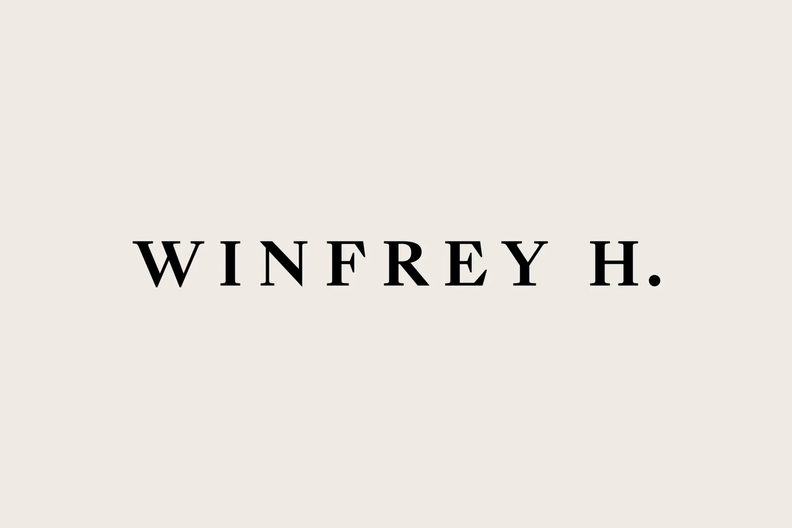
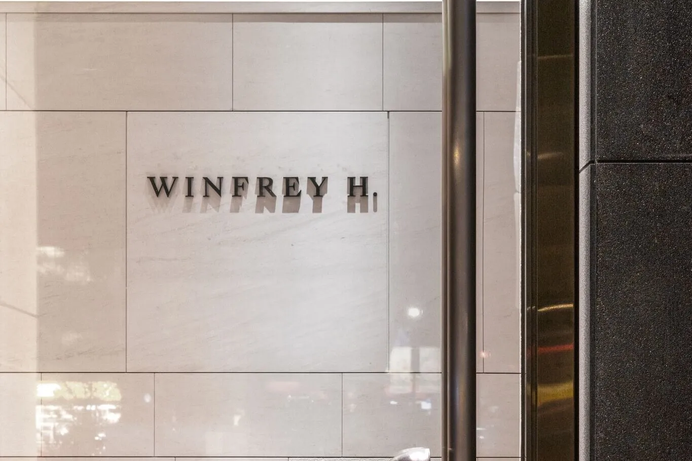
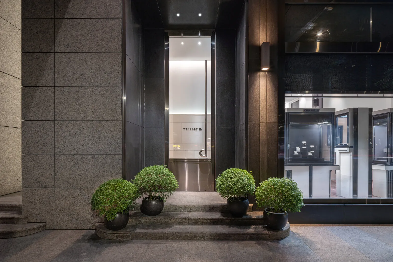
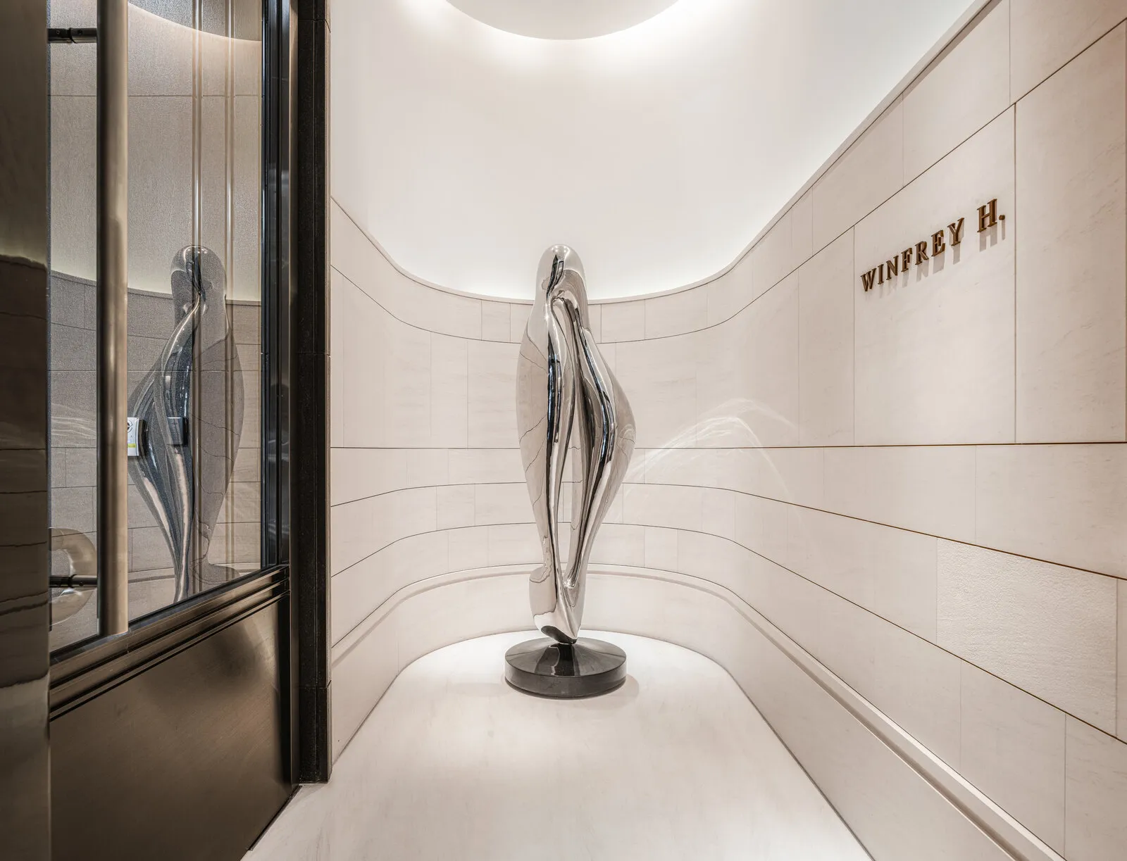
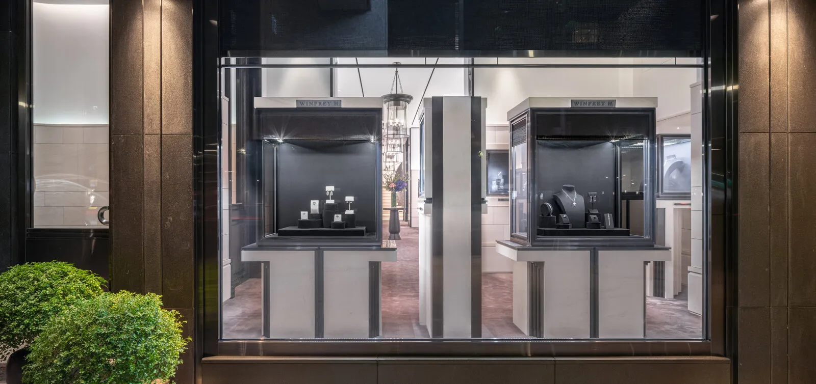
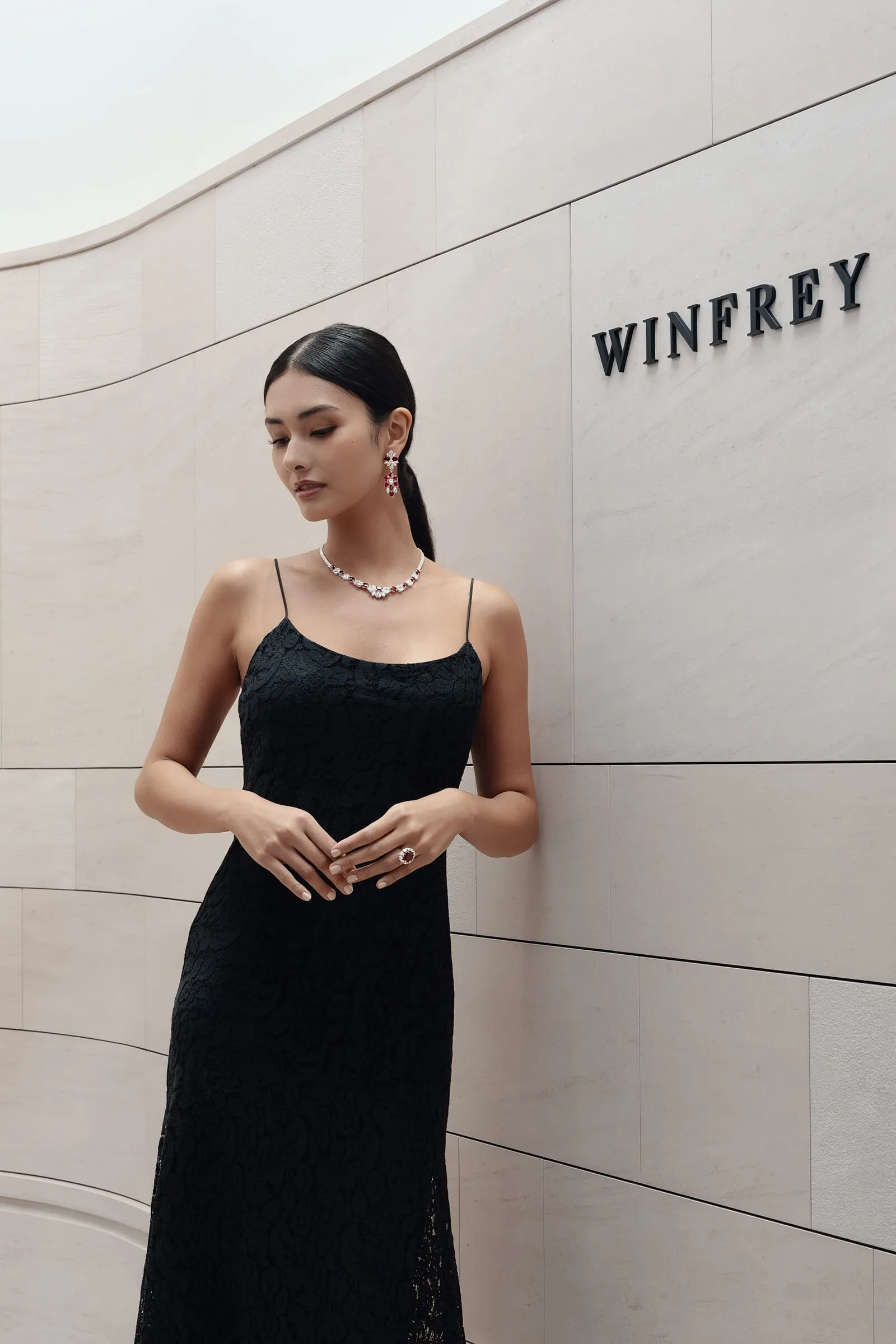
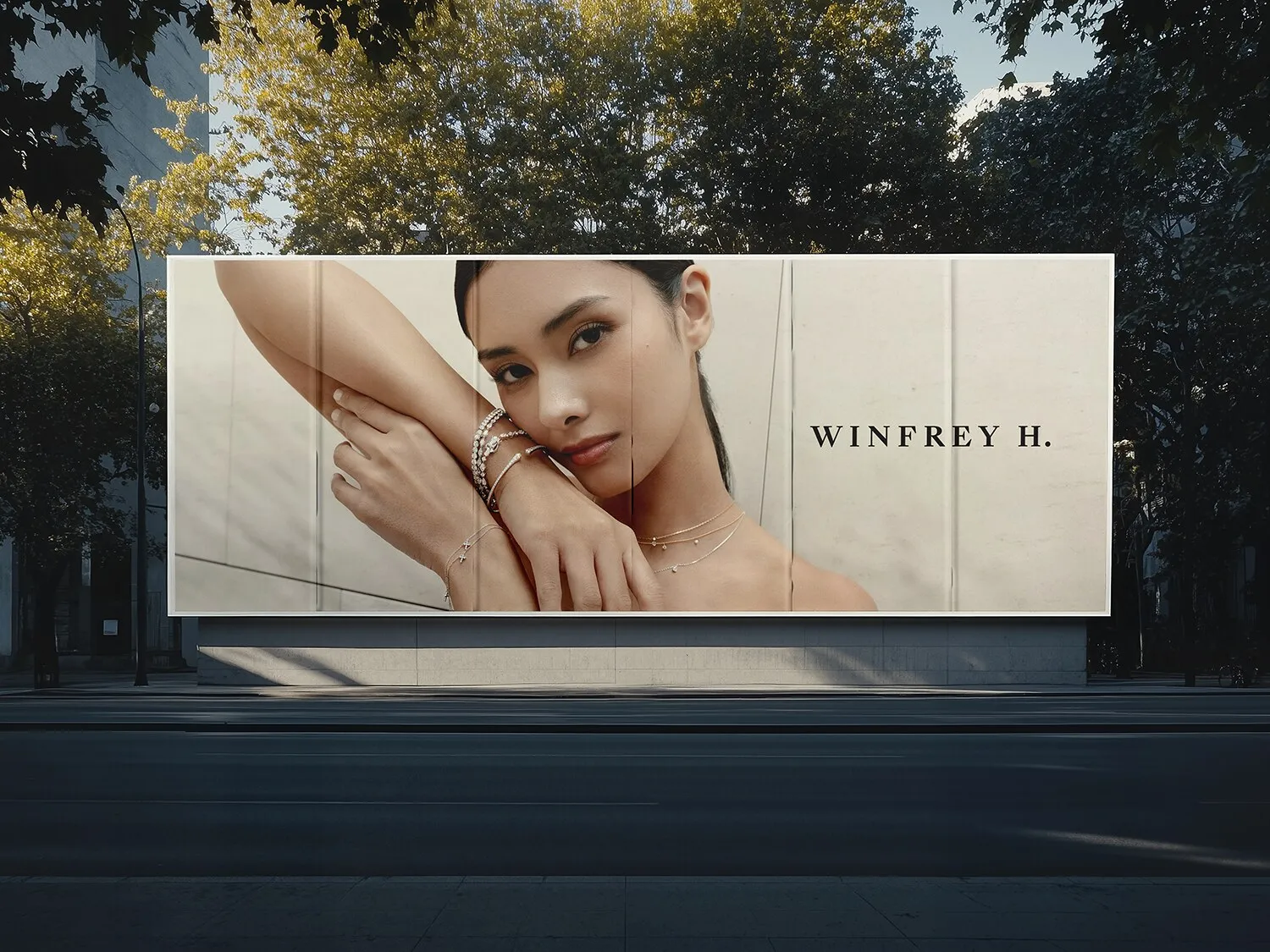
A high-contrast serif, letterspaced wide, closing on the abbreviated H. No monogram, no device, no ornament. In a room finished in pale stone and polished steel, a logo that performs is a logo competing with the product.
It had to hold at two sizes and very little in between: cut in metal across a facade, and stamped small on a card. Once it cleared, signage went into production and the building changed name.
We never left the building
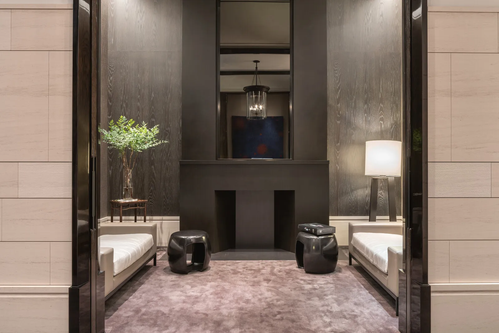
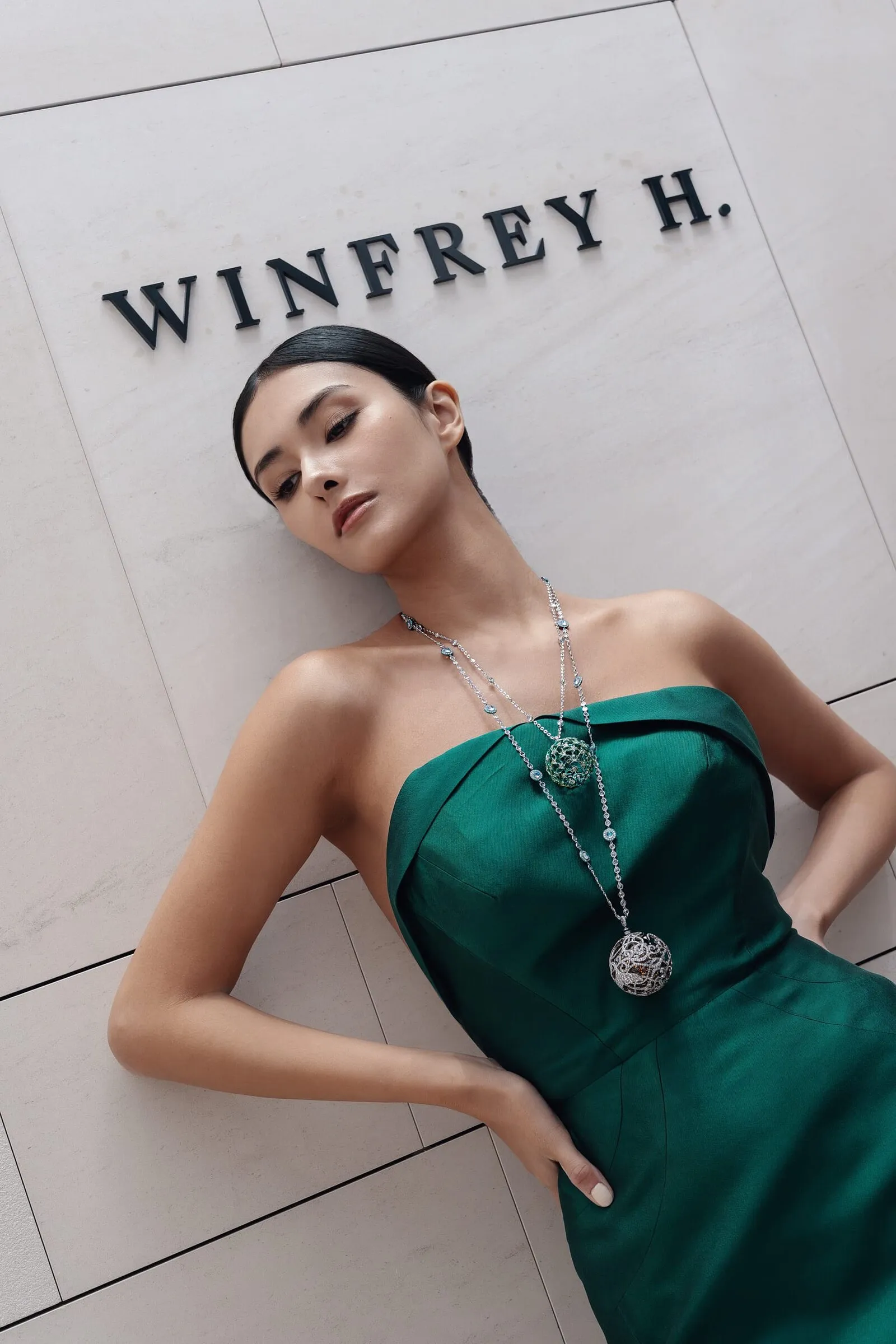
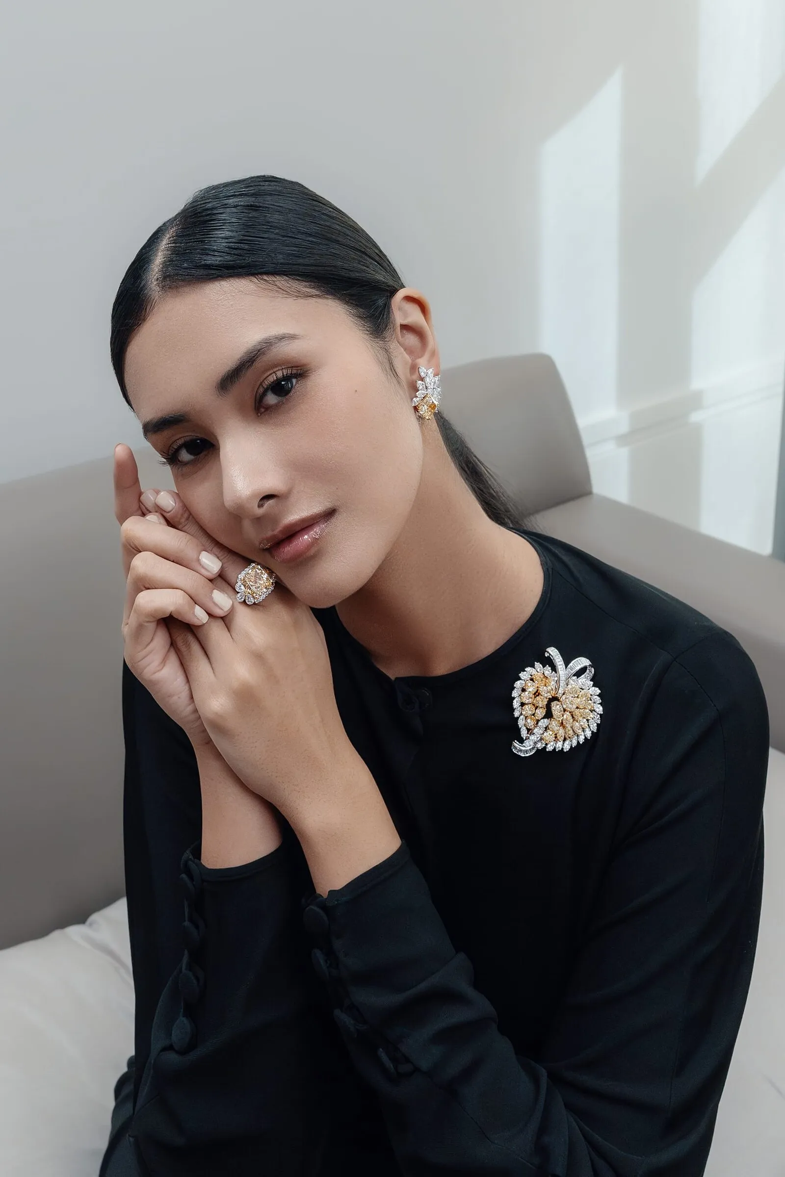
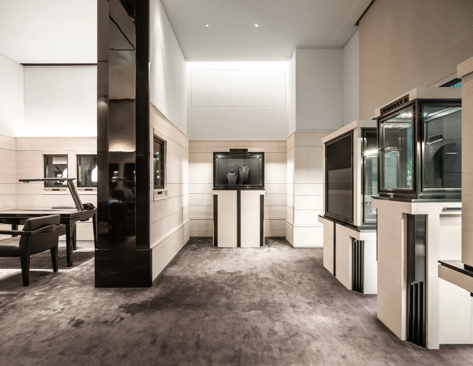
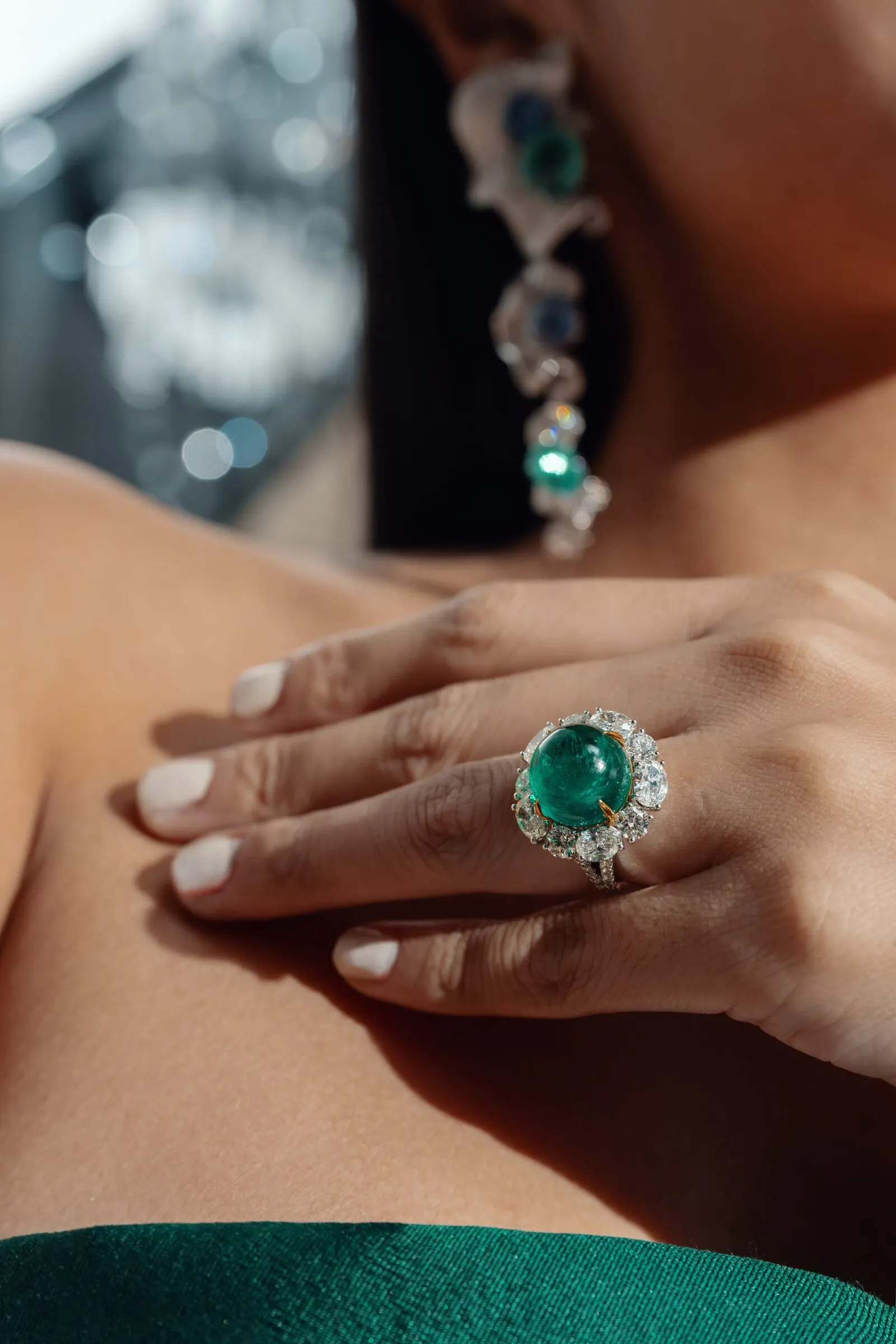
We took the team to Taiwan and used the store as the set. The curved stone wall, the spiral staircase under its crystal chandelier, the private rooms upstairs: the architecture was already the right answer, so we lit it and shot into it.
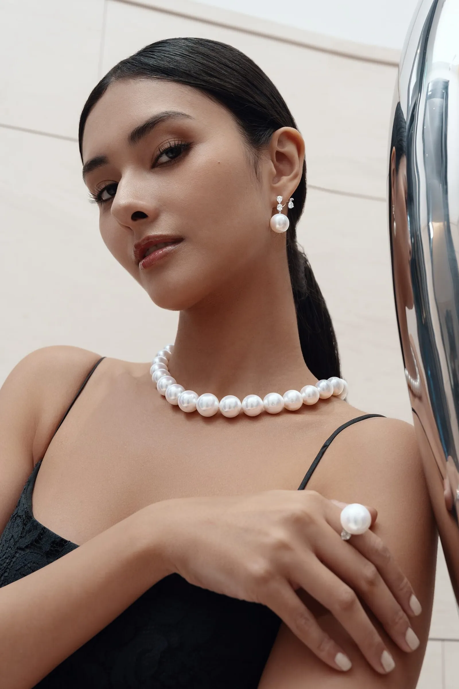
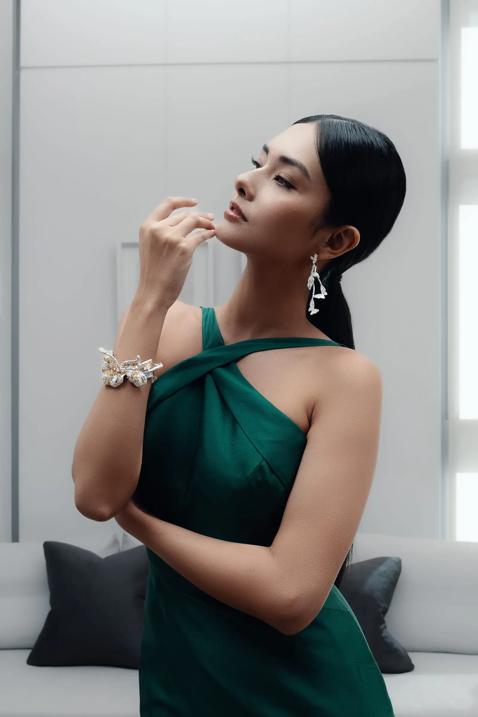
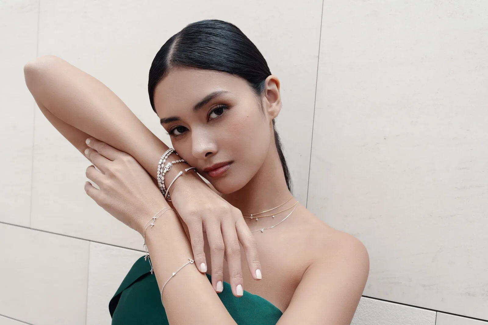
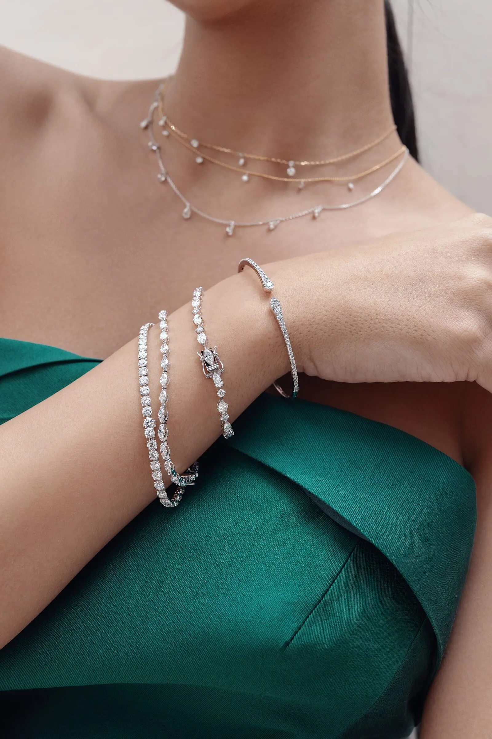
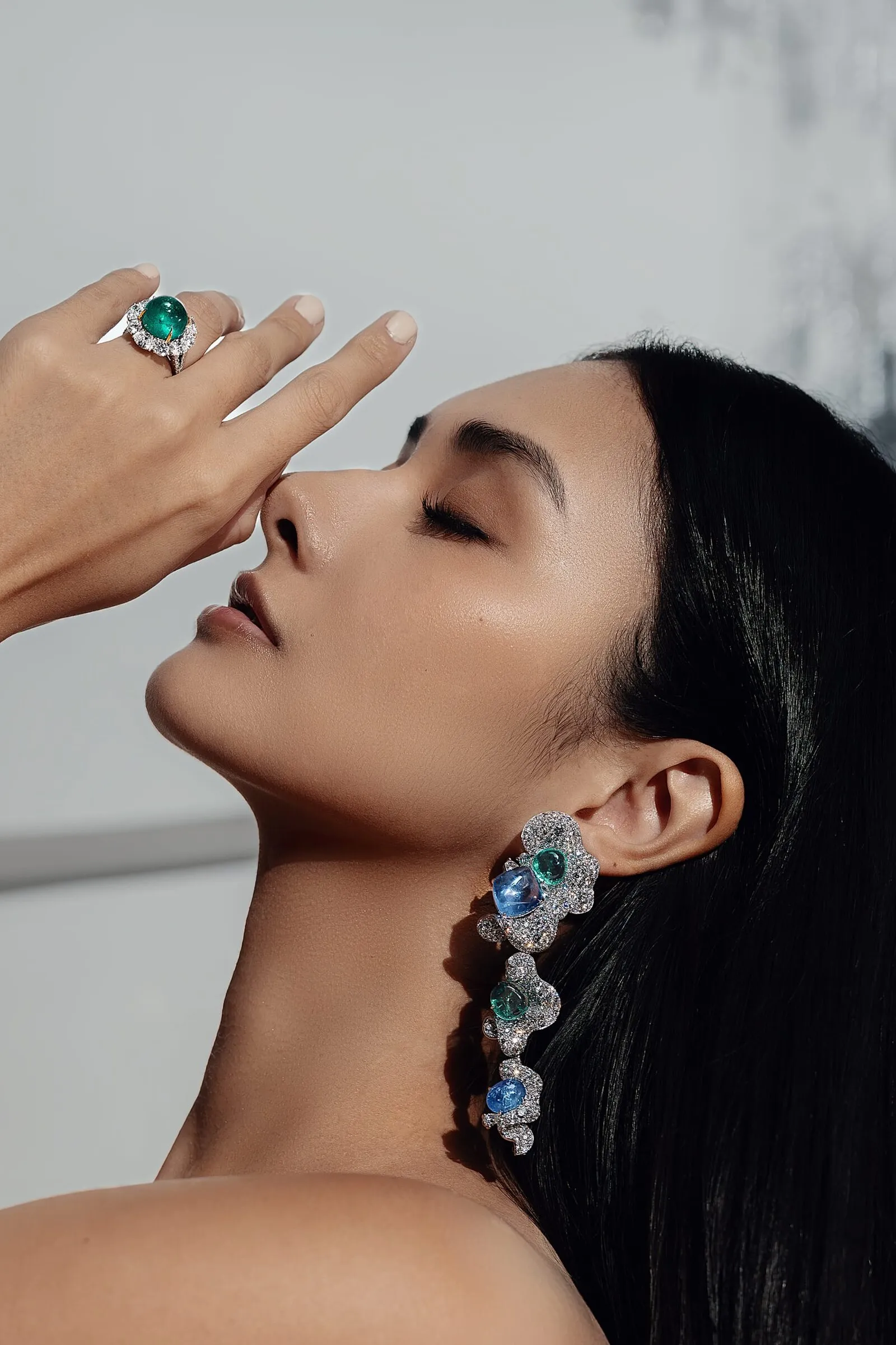
A short wardrobe list, deep green and black, chosen to sit under the stones rather than beside them.
A diamond forgives nothing out of focus
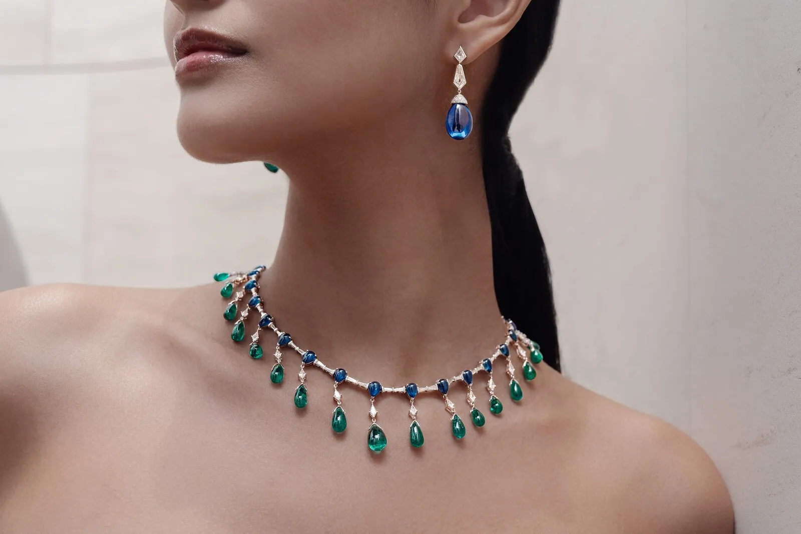
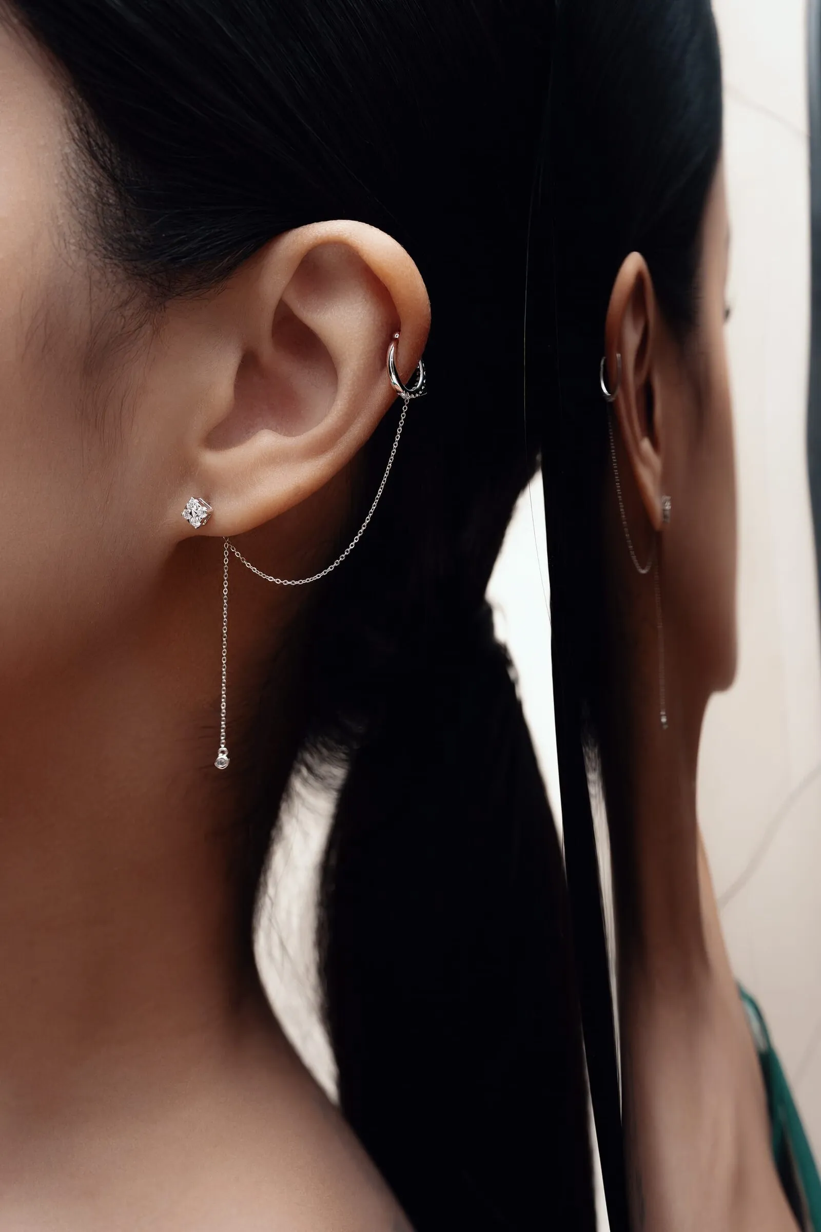
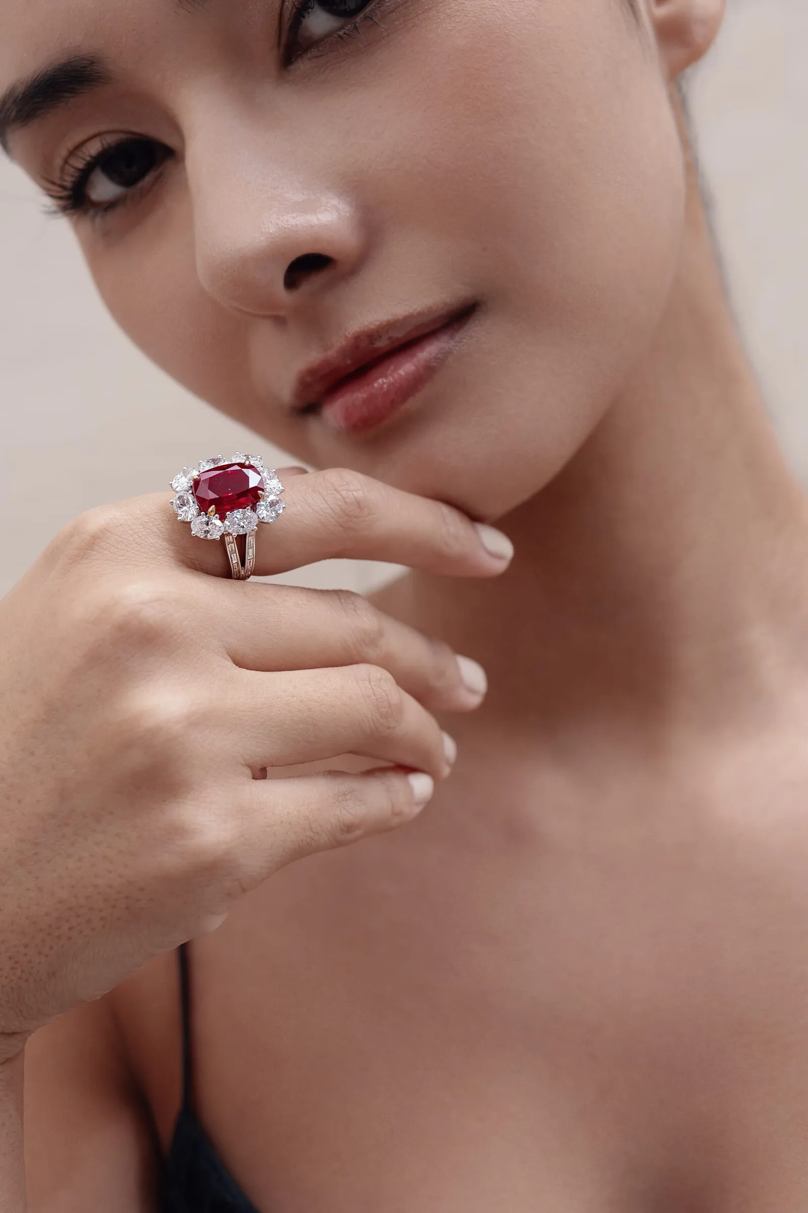
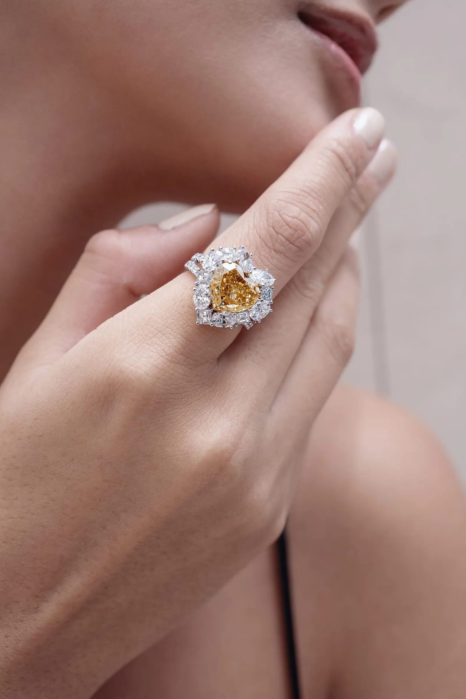
Every stone had to be razor sharp. On diamond that is the hardest ask there is: the light throws in every direction and every facet mirrors the studio back.
So the lighting was the real work. Enough to show the fire in the stone, just little enough that the reflections do not eat the setting.
The same shoot, cut vertical
The social edits come out of the same rooms and the same looks as the stills: the black lace against the storefront wall, the green gown in the rooms upstairs, the same light on the same stones.
Nothing is burnt into the frame, no captions and no logo bug, so one set of files runs in both languages and dates slowly.
Fifty-three pieces and no add-to-cart button
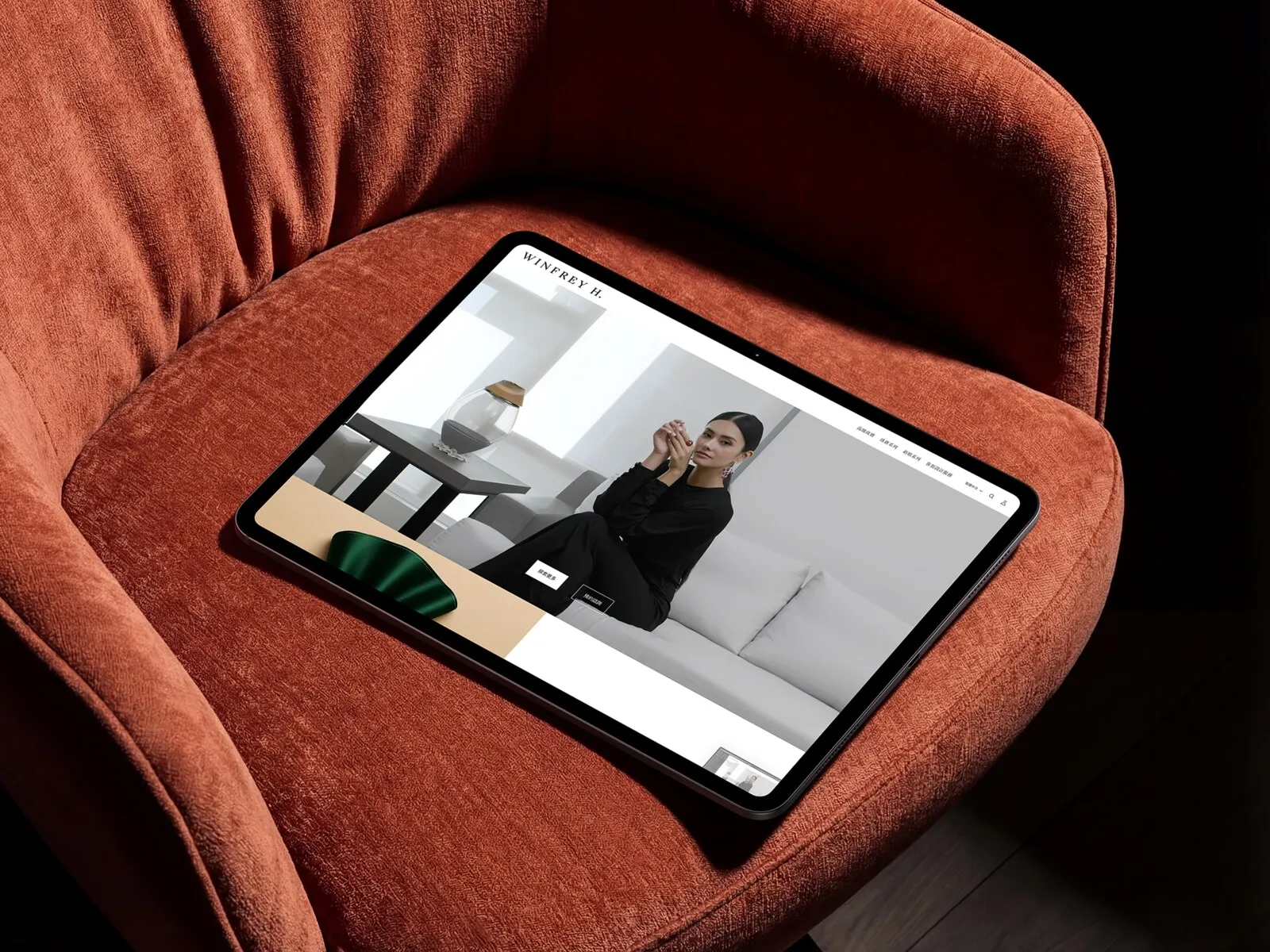
The webshop runs on Shopify, but high jewelry does not check out like a t-shirt. Every product page ends in Get quotation or Make an appointment, with the GIA certification sitting under it. The transaction still happens in the room we had just renamed.
Campaign frames carry the collection pages, pack shots carry the grid, and the whole thing runs in English and Traditional Chinese. Identity, imagery and storefront landed as one launch, in the order the business actually needed them.
“Working with MG has been a pleasure. Bringing the team out to Taiwan, preparing for the shoot together, and seeing how they work behind the scenes was amazing. We're very happy with the results.”
Let's work together
Fifteen minutes, no deck. Bring the product and we'll tell you honestly what we'd do with it.
Next case
BenQ - Zowie Europe